图片/图形
纯CSS3人物信息卡片UI设计效果
 PetitQ
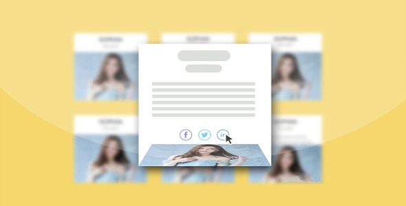
这是一组纯 CSS3 人物信息卡片 UI 设计效果。这组人物信息卡片共 9 种效果,每种效果在鼠标滑过卡片时,通过 CSS3 使图片和 HTML 元素变形生成 非常漂亮的鼠标滑过动画特效。
HTML 结构
该人物信息卡片的基本 HTML 结构如下:
也想出现在这里?联系我们吧

<div class="single-member effect-3">
<div class="member-image">
<img src="demo.jpg" alt="">
</div>
<div class="member-info">
<h3>标题</h3>
<h5>子标题</h5>
<p>描述信息...</p>
<div class="social-touch">
<a class="fb-touch" href="#"></a>
<a class="tweet-touch" href="#"></a>
<a class="linkedin-touch" href="#"></a>
</div>
</div>
</div>
CSS 样式
为卡片添加一些通用样式:
.single-member{width: 280px;
float: left;
font-family: sans-sarif;
margin: 30px 2.5%;
background-color: #fff;
text-align: center;
position: relative;
}.member-image img{
max-width: 100%;
vertical-align: middle;
}h3 {font-size: 24px;
font-weight: normal;
margin: 10px 0 0;
text-transform: uppercase;
}h5 {font-size: 16px;
font-weight: 300;
margin: 0 0 15px;
line-height: 22px;
}p {font-size: 14px;
font-weight: 300;
line-height: 22px;
padding: 0 30px;
margin-bottom: 10px;
}.social-touch a{
display: inline-block;
width: 27px;
height: 26px;
vertical-align: middle;
margin: 0 2px;
background-image: url(images/social-icons.png);
background-repeat: no-repeat;
opacity: 0.7;
transition: 0.3s;
}.social-touch a:hover{
opacity: 1;
transition: 0.3s;
}.fb-touch{background-position: 0 0;
}.tweet-touch{background-position: -35px 0;
}.linkedin-touch{background-position: -71px 0;
}.icon-colored .fb-touch{
background-position: 0 -27px;
}.icon-colored .tweet-touch{
background-position: -35px -27px;
}.icon-colored .linkedin-touch{
background-position: -71px -27px;
}
第三种效果的 CSS 代码如下:
.effect-3{
max-height: 302px;
min-height: 302px;
overflow: hidden;
}.effect-3 h3{
padding-top: 7px;
line-height: 33px;
}.effect-3 .member-image{
border-bottom: 5px solid #e5642b;
transition: 0.4s;
height: 212px;
width: 100%;
display: inline-block;
float: none;
vertical-align: middle;
}.effect-3 .member-info{
transition: 0.4s;
}.effect-3 .member-image img{
width: 100%;
vertical-align: bottom;
}.effect-3 .social-touch{
background-color: #e5642b;
float: left;
left: 0;
bottom: 0;
overflow: hidden;
padding: 5px 0;
width: 100%;
transition: 0.4s;
}.effect-3:hover .member-image{
border-bottom: 0;
border-radius: 0 0 50px 50px;
height: 81px;
display: inline-block;
overflow: hidden;
width: 109px;
transition: 0.4s;
}
其它效果的 CSS 代码请参考下载文件。
| 演示地址 | 下载地址 |
专业提供WordPress主题安装、深度汉化、加速优化等各类网站建设服务,详询在线客服!
也想出现在这里?联系我们吧