图片/图形
纯CSS3图片分类过滤效果
 PetitQ

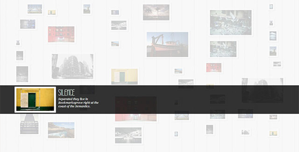
这是一款使用纯 css3 制作的图片分类过滤效果插件。该插件可以过滤出所有图片中的某一类图片。该图片分类过滤共有三种效果:图片模糊效果,图片缩小模糊效果和放大缩小效果。通过使用兄弟选择器和:checked 伪元素,我们能够轻易的切换 checkbox 或 radio 的状态。这个插件就是使用它们来实现的。这个插件的灵感来自于 Filtering elements without JS 。
html 结构
html 结构中需要 4 个用于分类的按钮,我们使用 radio 和 label 来制作这些按钮。在默认状态下,所有的图片都被显示。使用 Label 是为了只显示文本而隐藏 radio 按钮。
也想出现在这里?联系我们吧

<section class="ff-container">
<input id="select-type-all" name="radio-set-1" type="radio" class="ff-selector-type-all" checked="checked" />
<label for="select-type-all" class="ff-label-type-all">All</label>
<input id="select-type-1" name="radio-set-1" type="radio" class="ff-selector-type-1" />
<label for="select-type-1" class="ff-label-type-1">Web Design</label>
<input id="select-type-2" name="radio-set-1" type="radio" class="ff-selector-type-2" />
<label for="select-type-2" class="ff-label-type-2">Illustration</label>
<input id="select-type-3" name="radio-set-1" type="radio" class="ff-selector-type-3" />
<label for="select-type-3" class="ff-label-type-3">Icon Design</label>
<div class="clr"></div>
<ul class="ff-items">
<li class="ff-item-type-1">
<a href="http://dribbble.com/shots/366400-Chameleon">
<span>Chameleon</span>
<img src="images/1.jpg" />
</a>
</li>
<li class="ff-item-type-2">
<!-- ... -->
</li>
<li class="ff-item-type-3">
<!-- ... -->
</li>
<!-- ... -->
</ul>
</section>
无序列表中包含了所有的图片,每一个列表项的 class 各不相同,插件通过这个 class 来对图片进行过滤分类。
CSS 样式
首先来看通用样式,主容器要有一个宽度:
.ff-container{width: 564px;
margin: 10px auto 30px auto;
}
label 要遮盖住 radio,并给它一些好看的渐变:
.ff-container label{
font-family: 'BebasNeueRegular', 'Arial Narrow', Arial, sans-serif;
width: 25%;
height: 30px;
cursor: pointer;
color: #777;
text-shadow: 1px 1px 1px rgba(255,255,255,0.8);
line-height: 33px;
font-size: 19px;
background: linear-gradient(top, #ffffff 1%,#eaeaea 100%);
float:left;
box-shadow:
0px 0px 0px 1px #aaa,
1px 0px 0px 0px rgba(255,255,255,0.9) inset,
0px 1px 2px rgba(0,0,0,0.2);
}
给按钮一些圆角效果,因为按钮连成一排,只需要给第一个和最后一个按钮圆角即可:
.ff-container label.ff-label-type-all{
border-radius: 3px 0px 0px 3px;
}.ff-container label.ff-label-type-3{
border-radius: 0px 3px 3px 0px;
}
对于每一个没"checked"的 radio 按钮,我们给它下面这个"pressed"样式:
.ff-container input.ff-selector-type-all:checked ~ label.ff-label-type-all,
.ff-container input.ff-selector-type-1:checked ~ label.ff-label-type-1,
.ff-container input.ff-selector-type-2:checked ~ label.ff-label-type-2,
.ff-container input.ff-selector-type-3:checked ~ label.ff-label-type-3{
background: linear-gradient(top, #646d93 0%,#7c87ad 100%);
color: #424d71;
text-shadow: 0px 1px 1px rgba(255,255,255,0.3);
box-shadow:
0px 0px 0px 1px #40496e,
0 1px 2px rgba(0,0,0,0.1) inset;
}
因为所有的元素都在同一层,这里使用“~”兄弟选择器来选择它们各种的 label。这时候该隐藏 radio 按钮:
.ff-container input{
display: none;
}
给无序列表一些样式:
.ff-items{position: relative;
margin: 0px auto;
padding-top: 20px;
}
下面是无序列表中的 span 和 a 元素的样式:
.ff-items a{
display: block;
position: relative;
padding: 10px;
background: #fff;
box-shadow: 0 1px 2px rgba(0, 0, 0, 0.1);
margin: 4px;
width: 160px;
height: 120px;
}.ff-items a span{
display: block;
background: rgba(113,123,161, 0.9);
font-style: italic;
color: #fff;
font-weight: bold;
padding: 20px;
position: absolute;
bottom: 10px;
left: 10px;
width: 120px;
height: 0px;
overflow: hidden;
opacity: 0;
text-align: center;
text-shadow: 1px 1px 1px #303857;
transition: all 0.3s ease-in-out;
}.ff-items a:hover span{
height: 80px;
opacity: 1;
}.ff-items li img{
display: block;
}
当鼠标滑过图片时,从图片下方出现一个半透明遮罩效果。以上是三个 demo 的通用样式,具体每个 demo 的动画样式请参考下载文件。
| 演示地址 | 下载地址 |
专业提供WordPress主题安装、深度汉化、加速优化等各类网站建设服务,详询在线客服!
也想出现在这里?联系我们吧