图片/图形
CSS3鼠标滑过图片快速切换展示效果
 PetitQ
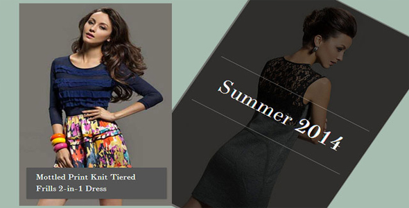
这是一款纯 css3 制作的鼠标滑过图片快速切换展示效果。该图片快速切换展示效果类似于电影中的快镜头播放效果,在鼠标滑过或鼠标悬停在图片上的时候,容器中的图片快速播放,鼠标离开后图片暂停播放。整个快速播放功能使用 CSS animations 完成,图片的播放和暂停使用的是 animation-play-state 。
html 结构
<div class="hs-wrapper">
<img src="images/1.jpg" alt="image01"/>
<img src="images/2.jpg" alt="image02"/>
<img src="images/3.jpg" alt="image03"/>
<img src="images/4.jpg" alt="image04"/>
<img src="images/5.jpg" alt="image05"/>
<img src="images/6.jpg" alt="image06"/>
<img src="images/7.jpg" alt="image07"/>
<img src="images/8.jpg" alt="image08"/>
<div class="hs-overlay">
<span>Summer <strong>2014</strong></span>
</div>
</div>
也想出现在这里?联系我们吧

CSS 样式
为图片添加显示和隐藏动画效果。
.hs-wrapper img{
top: 0px;
left: 0px;
position: absolute;
animation: showMe 0.8s linear infinite 0s forwards;
animation-play-state: paused;
}
只有鼠标滑过或悬停时图片才开始播放。其它部分 CSS 代码请参考下载文件。
.hs-wrapper:hover img{
animation-play-state: running;
}
播放效果只是简单的显示图片并将它放到容器的顶部。
@keyframes showMe {
0% { visibility: visible; z-index: 100; }
12.5% { visibility: visible; z-index: 100; }
25% { visibility: hidden; z-index: 0; }
100% { visibility: hidden; z-index: 0; }
}
现在所有的图片都有相同的 animation,但我们想为每个图片动画创建一些延时。我们还需要设置每张图片的 z-index。由于整个动画的时间为 0.8s,所以我们设置每张图片的延时为 0.1s(除了第一张图片)。
.hs-wrapper img:nth-child(1){
z-index: 9;
}.hs-wrapper img:nth-child(2){
animation-delay: 0.1s;
z-index: 8;
}.hs-wrapper img:nth-child(3){
animation-delay: 0.2s;
z-index: 7;
}.hs-wrapper img:nth-child(4){
animation-delay: 0.3s;
z-index: 6;
}<!-- ... and so on -->
遮罩层的 css 代码如下:
.hs-overlay{position: absolute;
width: 100%;
height: 100%;
opacity: 0;
z-index: 500;
background: rgba(0,0,0,0.6);
box-shadow: 0 0 0 0 rgba(255,255,255,0.3) inset;
pointer-events: none;
transition: all 0.3s linear;
}
当鼠标滑过时,显示遮罩层:
.hs-wrapper:hover .hs-overlay{
opacity: 1;
box-shadow: 0 0 0 5px rgba(255,255,255,0.3) inset;
}
更详细的 css 代码请参考下载文件。
| 演示地址 | 下载地址 |
专业提供WordPress主题安装、深度汉化、加速优化等各类网站建设服务,详询在线客服!
也想出现在这里?联系我们吧