导航菜单
纯CSS3黑色气泡背景动画菜单
 PetitQ
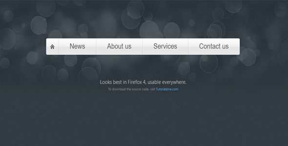
今天我们要来分享一款非常酷的 CSS3 动画菜单,这款 CSS3 菜单有一个很漂亮的黑色气泡背景,菜单是银白色的,和黑色的背景交织在一起更加显得有 3D 立体的视觉效果。CSS3 的运用让菜单有圆角的效果,鼠标滑过菜单时也会改变背景。下面是实现这款 CSS3 菜单的过程和源代码,一起来看看。
HTML 代码:
<nav><ul class="fancyNav"><li id="home"><a href="#home" class="homeIcon">Home</a></li>
<li id="news"><a href="#news">News</a></li>
<li id="about"><a href="#about">About us</a></li>
<li id="services"><a href="#services">Services</a></li>
<li id="contact"><a href="#contact">Contact us</a></li>
</ul></nav>
也想出现在这里?联系我们吧

这里我们用了 ul li 列表构造了菜单的结构,非常简单。
CSS 代码:
.fancyNav{/* Affects the UL element */overflow: hidden;
display: inline-block;
}.fancyNav li{
/* Specifying a fallback color and we define CSS3 gradients for the major browsers: */background-color: #f0f0f0;
background-image: -webkit-gradient(linear,left top, left bottom,from(#fefefe), color-stop(0.5,#f0f0f0), color-stop(0.51, #e6e6e6));
background-image: -moz-linear-gradient(#fefefe 0%, #f0f0f0 50%, #e6e6e6 51%);
background-image: -o-linear-gradient(#fefefe 0%, #f0f0f0 50%, #e6e6e6 51%);
background-image: -ms-linear-gradient(#fefefe 0%, #f0f0f0 50%, #e6e6e6 51%);
background-image: linear-gradient(#fefefe 0%, #f0f0f0 50%, #e6e6e6 51%);
border-right: 1px solid rgba(9, 9, 9, 0.125);
/* Adding a 1px inset highlight for a more polished efect: */box-shadow: 1px -1px 0 rgba(255, 255, 255, 0.6) inset;
-moz-box-shadow: 1px -1px 0 rgba(255, 255, 255, 0.6) inset;
-webkit-box-shadow: 1px -1px 0 rgba(255, 255, 255, 0.6) inset;
position:relative;
float: left;
list-style: none;
}.fancyNav li:after{
/* This creates a pseudo element inslide each LI */content:'.';
text-indent:-9999px;
overflow:hidden;
position:absolute;
width:100%;
height:100%;
top:0;
left:0;
z-index:1;
opacity:0;
/* Gradients! */background-image:-webkit-gradient(linear, left top, right top, from(rgba(168,168,168,0.5)),color-stop(0.5,rgba(168,168,168,0)), to(rgba(168,168,168,0.5)));
background-image:-moz-linear-gradient(left, rgba(168,168,168,0.5), rgba(168,168,168,0) 50%, rgba(168,168,168,0.5));
background-image:-o-linear-gradient(left, rgba(168,168,168,0.5), rgba(168,168,168,0) 50%, rgba(168,168,168,0.5));
background-image:-ms-linear-gradient(left, rgba(168,168,168,0.5), rgba(168,168,168,0) 50%, rgba(168,168,168,0.5));
background-image:linear-gradient(left, rgba(168,168,168,0.5), rgba(168,168,168,0) 50%, rgba(168,168,168,0.5));
/* Creating borders with box-shadow. Useful, as they don't affect the size of the element. */box-shadow:-1px 0 0 #a3a3a3,-2px 0 0 #fff,1px 0 0 #a3a3a3,2px 0 0 #fff;
-moz-box-shadow:-1px 0 0 #a3a3a3,-2px 0 0 #fff,1px 0 0 #a3a3a3,2px 0 0 #fff;
-webkit-box-shadow:-1px 0 0 #a3a3a3,-2px 0 0 #fff,1px 0 0 #a3a3a3,2px 0 0 #fff;
/* This will create a smooth transition for the opacity property */-moz-transition:0.25s all;
-webkit-transition:0.25s all;
-o-transition:0.25s all;
transition:0.25s all;
}/* Treating the first LI and li:after elements separately */.fancyNav li:first-child{
border-radius: 4px 0 0 4px;
}.fancyNav li:first-child:after,
.fancyNav li.selected:first-child:after{
box-shadow:1px 0 0 #a3a3a3,2px 0 0 #fff;
-moz-box-shadow:1px 0 0 #a3a3a3,2px 0 0 #fff;
-webkit-box-shadow:1px 0 0 #a3a3a3,2px 0 0 #fff;
border-radius:4px 0 0 4px;
}.fancyNav li:last-child{
border-radius: 0 4px 4px 0;
}/* Treating the last LI and li:after elements separately */.fancyNav li:last-child:after,
.fancyNav li.selected:last-child:after{
box-shadow:-1px 0 0 #a3a3a3,-2px 0 0 #fff;
-moz-box-shadow:-1px 0 0 #a3a3a3,-2px 0 0 #fff;
-webkit-box-shadow:-1px 0 0 #a3a3a3,-2px 0 0 #fff;
border-radius:0 4px 4px 0;
}.fancyNav li:hover:after,
.fancyNav li.selected:after,
.fancyNav li:target:after{
/* This property triggers the CSS3 transition */opacity:1;
}.fancyNav:hover li.selected:after,
.fancyNav:hover li:target:after{
/* Hides the targeted li when we are hovering on the UL */opacity:0;
}.fancyNav li.selected:hover:after,
.fancyNav li:target:hover:after{
opacity:1 !important;
}/* Styling the anchor elements */.fancyNav li a{
color: #5d5d5d;
display: inline-block;
font: 20px/1 Lobster,Arial,sans-serif;
padding: 12px 35px 14px;
position: relative;
text-shadow: 1px 1px 0 rgba(255, 255, 255, 0.6);
z-index:2;
text-decoration:none !important;
white-space:nowrap;
}.fancyNav a.homeIcon{
background:url('../img/home.png') no-repeat center center;
display: block;
overflow: hidden;
padding-left: 12px;
padding-right: 12px;
text-indent: -9999px;
width: 16px;
}
这款 CSS 菜单非常不错,大家可以尝试一下。
| 演示地址 | 下载地址 |
专业提供WordPress主题安装、深度汉化、加速优化等各类网站建设服务,详询在线客服!
也想出现在这里?联系我们吧