


导航菜单
炫酷CSS3过渡动画全屏导航菜单UI设计
 PetitQ
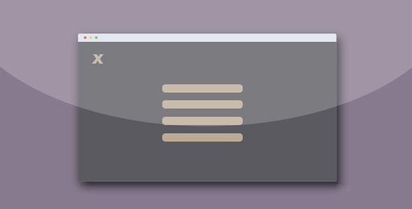
这是一款效果非常炫酷的带炫酷 CSS3 过渡动画的全屏导航菜单网页 UI 设计效果。该导航菜单使用 CSS3 和少量的 jQuery 来制作,当用户点击左上角的汉堡包按钮时,全屏菜单将从屏幕上方滑动显示出来。
HTML 结构
该全屏导航菜单的汉堡包按钮使用一个
也想出现在这里?联系我们吧

元素来包裹一个按钮元素,按钮中使用一组元素来作为汉堡包按钮的三根线条。

注册 |
忘记密码
<div class="nav">
<button class="btn-nav">
<span class="icon-bar top"></span>
<span class="icon-bar middle"></span>
<span class="icon-bar bottom"></span>
</button>
</div>
导航菜单使用一个
来包裹一个无序列表。默认状态下它是隐藏的。
<div class="nav-content hideNav hidden">
<ul class="nav-list">
<li class="nav-item"><a href="#" class="item-anchor">item 1</a></li>
<li class="nav-item"><a href="#" class="item-anchor">item 2</a></li>
<li class="nav-item"><a href="#" class="item-anchor">item 3</a></li>
<li class="nav-item"><a href="#" class="item-anchor">item 4</a></li>
</ul>
</div>
CSS 样式
汉堡包按钮的基本 CSS 样式如下:当汉堡包按钮被鼠标点击或在移动触摸设备上被触摸的时候,它会被添加一个 animated class,这个 class 类用来制作汉堡包按钮的颜色变化动画和变形动画。
.btn-nav {
position: fixed;
top: 50px;
left: 30px;
background: transparent;
border: none;
padding: 10px;
-webkit-transition: all .5s ease;
-moz-transition: all .5s ease;
-ms-transition: all .5s ease;
-o-transition: all .5s ease;
transition: all .5s ease;
cursor: pointer;
z-index: 99999;
}.btn-nav:focus {
outline: 0;
}.icon-bar {
display: block;
margin: 6px 0;
width: 40px;
height: 5px;
background-color: #FFFFFF;
}.btn-nav:hover .icon-bar {
-webkit-transition: all 1s ease;
-moz-transition: all 1s ease;
-ms-transition: all 1s ease;
-o-transition: all 1s ease;
transition: all 1s ease;
background-color: #FCA311;
}.animated {
display: block;
margin: 0 auto;
}.animated:hover .icon-bar,
.animated:focus .icon-bar{
background-color: #FCA311;
}.animated:focus {
cursor: pointer;
z-index: 9999;
}.middle {
margin: 0 auto;
}.icon-bar {
-webkit-transition: all .7s ease;
-moz-transition: all .7s ease;
-ms-transition: all .7s ease;
-o-transition: all .7s ease;
transition: all .7s ease;
z-index: 999999;
}.animated .icon-bar {
z-index: 999999;
background-color: #FCA311;
}.animated .top {
-webkit-transform: translateY(10px) rotateZ(45deg);
-moz-transform: translateY(10px) rotateZ(45deg);
-ms-transform: translateY(10px) rotateZ(45deg);
-o-transform: translateY(10px) rotateZ(45deg);
transform: translateY(10px) rotateZ(45deg);
}.animated .bottom {
-webkit-transform: translateY(-11px) rotateZ(-45deg);
-moz-transform: translateY(-11px) rotateZ(-45deg);
-ms-transform: translateY(-11px) rotateZ(-45deg);
-o-transform: translateY(-11px) rotateZ(-45deg);
transform: translateY(-11px) rotateZ(-45deg);
}.animated .middle {
width: 0;
}
全屏导航菜单的 CSS 样式也非常简单:默认情况下它使用 hidden 和 hidden class 类来隐藏,在用户用鼠标点击或在移动触摸设备中触摸了汉堡包按钮时,将移除这两个 class 类,替换为 showNav class。
.nav {
position: relative;
width: auto;
display: inline-block;
border: none;
}.nav-content {
position: fixed;
top: -100%;
bottom: 0;
left: 0;
right: 0;
background: #000000;
display: block;
height: 100%;
z-index: 9;
}.nav-list {
list-style: none;
padding: 0;
position: relative;
top: 30%;
}.item-anchor:after {
content: "";
position: absolute;
width: 3px;
height: 3px;
left: 0;
bottom: 0;
z-index: 9;
background: transparent;
-webkit-transition: all 1s ease;
-moz-transition: all 1s ease;
-ms-transition: all 1s ease;
-o-transition: all 1s ease;
transition: all 1s ease;
}.item-anchor {
color: #fff;
font-size: 30px;
text-transform: uppercase;
position: relative;
text-decoration: none;
padding: 10px;
}.item-anchor:hover,
.item-anchor:focus {
color: #FCA311;
-webkit-transition: all 1s ease;
-moz-transition: all 1s ease;
-ms-transition: all 1s ease;
-o-transition: all 1s ease;
transition: all 1s ease;
}.item-anchor:hover:after,
.item-anchor:focus:after{
width: 100%;
background: #FCA311;
-webkit-transition: all 1s ease;
-moz-transition: all 1s ease;
-ms-transition: all 1s ease;
-o-transition: all 1s ease;
transition: all 1s ease;
}.nav-item {
margin: 40px auto;
text-align: center;
}.hideNav {
-webkit-animation: hideNav 1s ease forwards;
-moz-animation: hideNav 1s ease forwards;
-o-animation: hideNav 1s ease forwards;
animation: hideNav 1s ease forwards;
}.hidden {
display: none;
}
JavaScript
该全屏菜单使用 jQuery 来处理汉堡包按钮被鼠标点击或移动触摸时的事件。
$(window).load(function () {
$('.btn-nav').on('click tap', function () {
$('.nav-content').toggleClass('showNav hideNav').removeClass('hidden');
$(this).toggleClass('animated');
});
});
| 演示地址 | 下载地址 |
专业提供WordPress主题安装、深度汉化、加速优化等各类网站建设服务,详询在线客服!
也想出现在这里?联系我们吧
相关文章
热销模板

本站承接 WordPress / PbootCMS / DedeCMS 等
系统建站、仿站、开发、定制等业务!
登录