图片/图形
纯CSS3鼠标悬停图片3D动画特效
 PetitQ
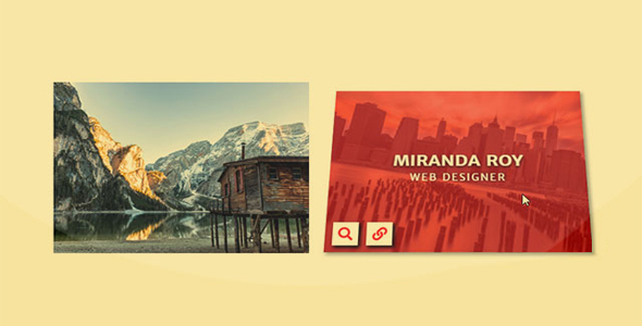
这是一款纯 CSS3 鼠标悬停图片 3D 动画特效。该特效在鼠标悬停到图片上面的时候,图片通过 CSS 实现 3D 倾斜动画,并显示出遮罩层,非常炫酷。
使用方法
在页面中引入下面的文件。
也想出现在这里?联系我们吧

<link rel="stylesheet" type="text/css" href="./css/bootstrap.min.css">
<link rel="stylesheet" type="text/css" href="./css/font-awesome.min.css">
HTML 结构
<div class="container">
<div class="row">
<div class="col-md-4 col-sm-6">
<div class="box">
<img src="images/img-1.jpg">
<div class="box-content">
<h3 class="title">Williamson</h3>
<span class="post">Web designer</span>
</div>
<ul class="icon">
<li><a href="#"><i class="fa fa-search"></i></a></li>
<li><a href="#"><i class="fa fa-link"></i></a></li>
</ul>
</div>
</div>
<div class="col-md-4 col-sm-6">
<div class="box">
<img src="images/img-2.jpg">
<div class="box-content">
<h3 class="title">Miranda Roy</h3>
<span class="post">Web designer</span>
</div>
<ul class="icon">
<li><a href="#"><i class="fa fa-search"></i></a></li>
<li><a href="#"><i class="fa fa-link"></i></a></li>
</ul>
</div>
</div>
</div>
</div>
CSS 样式
.box{font-family: 'Merriweather Sans', sans-serif;
text-align: center;
transform: perspective(900px);
transform-style: preserve-3d;
overflow: hidden;
position: relative;
transition: all .5s;
}.box:hover{
box-shadow: 3px 3px 5px #999;
transform: perspective(900px) rotateX(20deg) rotateY(0deg);
}.box:before{
content: '';
background: #f20909;
width: 100%;
height: 100%;
transform: scale3d(0, 1, 0);
transform-origin: center;
position: absolute;
top: 0;
left: 0;
z-index: 1;
transition: all .5s ease .1s;
}.box:hover:before{
opacity: 0.6;
transform: scale3d(1, 1, 1);
}.box img{
width: 100%;
height: 100%;
transition: all 0.5s;
}.box:hover img{ transform: rotate(10deg) scale(1.3); }
.box .box-content{
width: 100%;
opacity: 0;
transform: translateX(-50%) translateY(-50%) scale(0);
position: absolute;
top: 50%;
left: 50%;
z-index: 1;
transition: all 0.4s linear 0s;
}.box:hover .box-content{
opacity: 1;
transform: translateX(-50%) translateY(-50%) scale(1);
}.box .title{
color: #fff;
font-size: 25px;
font-weight: 700;
text-transform: uppercase;
text-shadow: 0 2px 5px #000;
margin: 0 0 3px 0;
}.box .post{
color: #fff;
font-size: 15px;
letter-spacing: 2px;
text-shadow: 2px 0 5px #000;
text-transform: uppercase;
}.box .icon{
padding: 0;
margin: 0;
list-style: none;
position: absolute;
bottom: 10px;
left: 10px;
z-index: 1;
}.box .icon li{
display: inline-block;
opacity: 0;
transition: all 0.3s;
}.box:hover .icon li:nth-child(1){ transition-delay: 0.3s; }
.box:hover .icon li:nth-child(2){ transition-delay: 0.45s; }
.box:hover .icon li{ opacity: 1; }
.box .icon li a{
color: #f20909;
background-color: #fff;
font-size: 20px;
line-height: 35px;
height: 35px;
width: 35px;
margin: 0 7px 0 0;
box-shadow: 3px 3px 5px #000;
display: block;
transition: all 0.3s;
}.box .icon li a:hover{
color: #fff;
background-color: transparent;
}@media only screen and (max-width:990px){
.box { margin: 0 0 30px; }
}@media only screen and (max-width:767px){
.box{ margin: 0 20px 30px; }
}@media only screen and (max-width:576px){
.box{ margin: 0 5px 30px; }
}@media only screen and (max-width:479px){
.box{ margin: 0 0 30px; }
.box .title{ font-size: 21px; }
.box .post{ font-size: 14px; }
}
| 演示地址 | 下载地址 |
专业提供WordPress主题安装、深度汉化、加速优化等各类网站建设服务,详询在线客服!
也想出现在这里?联系我们吧