图片/图形
CSS3图片鼠标悬停动画特效
 PetitQ
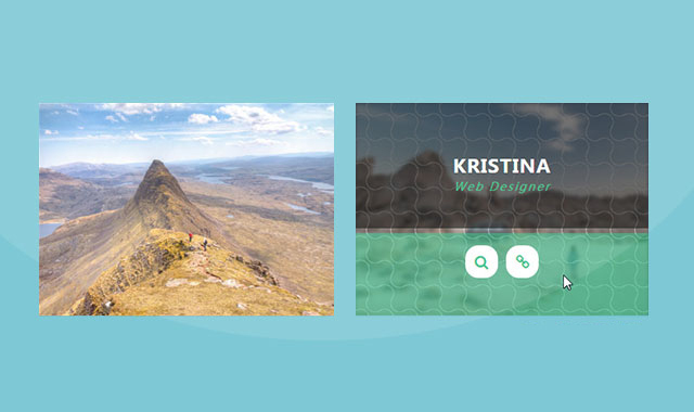
这是一款 CSS3 图片鼠标悬停动画特效。该特效在鼠标悬停到图片上面的时候,利用 CSS3 制作上下关门的动画效果,非常炫酷。
HTML 结构
基本的 HTML 结构如下
也想出现在这里?联系我们吧

<div class="container">
<div class="row">
<div class="col-md-4 col-sm-6">
<div class="box">
<img src="images/img-1.jpg" alt="">
<div class="box-content">
<h3 class="title">Williamson</h3>
<span class="post">web developer</span>
</div>
<ul class="icon">
<li><a href="#"><i class="fa fa-search"></i></a></li>
<li><a href="#"><i class="fa fa-link"></i></a></li>
</ul>
</div>
</div>
<div class="col-md-4 col-sm-6">
<div class="box">
<img src="images/img-2.jpg" alt="">
<div class="box-content">
<h3 class="title">Kristina</h3>
<span class="post">web designer</span>
</div>
<ul class="icon">
<li><a href="#"><i class="fa fa-search"></i></a></li>
<li><a href="#"><i class="fa fa-link"></i></a></li>
</ul>
</div>
</div>
<div class="col-md-4 col-sm-6">
<div class="box">
<img src="images/img-3.jpg" alt="">
<div class="box-content">
<h3 class="title">Miranda Roy</h3>
<span class="post">web developer</span>
</div>
<ul class="icon">
<li><a href="#"><i class="fa fa-search"></i></a></li>
<li><a href="#"><i class="fa fa-link"></i></a></li>
</ul>
</div>
</div>
</div>
</div>
CSS 样式
.box{font-family: 'Ubuntu', sans-serif;
overflow: hidden;
position: relative;
transition: all 0.3s;
}.box:hover{ box-shadow: 0 0 15px -5px #000; }
.box:before{
content: '';
background-color: transparent;
background-image:
radial-gradient(circle at 20% 80%, transparent 29%, rgba(255,255,255,0.4) 30%, rgba(255,255,255,0.4) 33%, transparent 34%),
radial-gradient(circle at 80% 20%, transparent 29%, rgba(255,255,255,0.4) 30%, rgba(255,255,255,0.4) 33%, transparent 34%);
background-size: 30px 30px;
height: 100%;
width: 100%;
opacity: 0;
position: absolute;
left: 0;
top: 0;
z-index: 1;
transition: all 0.3s ease 0.2s;
}.box:hover:before{ opacity: 1; }
.box img{
width: 100%;
height: auto;
transition: all 0.3s ease 0s;
}.box:hover img{ filter:blur(2px); }
.box .box-content{
color: #fff;
background-color: rgba(0,0,0,0.6);
text-align: center;
width: 100%;
height: 59%;
padding: 18% 0 0 0;
position: absolute;
left: 0;
top: -100%;
z-index: 2;
transition: all 0.3s ease 0s;
}.box:hover .box-content{ top: 0; }
.box .title{
color: #fff;
font-size: 23px;
font-weight: 600;
letter-spacing: 1px;
text-transform: uppercase;
margin: 0;
}.box .post{
color: #32c287;
font-size:14px;
font-style: italic;
text-transform: capitalize;
letter-spacing: 2px;
}.box .icon{
background: rgba(50,194,135,0.6);
text-align: center;
height: 39%;
width: 100%;
padding: 15px 0 0;
margin: 0;
list-style: none;
transform: translateX(50%);
position: absolute;
right: 50%;
bottom: -100%;
z-index: 1;
transition: all 0.3s;
}.box:hover .icon{ bottom: 0; }
.box .icon li{
display: inline-block;
margin: 0 3px;
}.box .icon li a{
color: #32c287;
background-color: #fff;
font-size: 18px;
line-height: 40px;
height: 40px;
width: 40px;
border-radius: 40%;
display: block;
transition:all 0.3s;
}.box .icon li a:hover{
color: #fff;
background-color: #04a562;
box-shadow: 0 0 0 3px rgba(255,255,255,0.5),0 0 5px rgba(0,0,0,0.5) inset;
}@media only screen and (max-width:990px){
.box{ margin-bottom: 30px; }
}@media only screen and (max-width:479px){
.box .title{ font-size: 20px; }
}
| 演示地址 | 下载地址 |
专业提供WordPress主题安装、深度汉化、加速优化等各类网站建设服务,详询在线客服!
也想出现在这里?联系我们吧