图片/图形
纯CSS3超酷文章卡片UI设计效果
 PetitQ
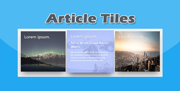
这是一款使用纯 CSS3 制作的超酷文章卡片 UI 设计效果。该文章卡片带有阴影效果,当鼠标滑过卡片时,文章的描述信息会以滑动动画的方式显示在卡片中。
HTML 结构
一张卡片的 HTML 结构如下:
也想出现在这里?联系我们吧

<div class="tile">
<img src="img/1.jpg"/>
<div class="text">
<h1>文章标题</h1>
<h2 class="animate-text">文章子标题</h2>
<p class="animate-text">文章的描述信息</p>
<div class="dots">
<span></span>
<span></span>
<span></span>
</div>
</div>
</div>
CSS 样式
整个卡片包裹容器以 flex 进行布局。
.wrap{margin:50px auto 60px auto;
width:100%;
display:flex;
align-items:space-around;
max-width:1200px;
}
每张卡片的宽度和高度都设置为 380 像素。并使用 box-shadow 属性为卡片设置一个大阴影效果,同时为所有的动画设置 ease-out 效果的过渡动画。
.tile{width:380px;
height:380px;
margin:10px;
background-color:#99aeff;
display:inline-block;
background-size:cover;
position:relative;
cursor:pointer;
transition: all 0.4s ease-out;
box-shadow: 0px 35px 77px -17px rgba(0,0,0,0.44);
overflow:hidden;
color:white;
font-family:'Microsoft YaHei',sans-serif;
}
卡片中的图片使用绝对定位,宽度和高度都为 100%,占据满整个卡片。
.tile img{
height:100%;
width:100%;
position:absolute;
top:0;
left:0;
z-index:0;
transition: all 0.4s ease-out;
}
卡片中的文本层页采用绝对定位,通过 z-index 属性将文字放置在图片之上。h2 文本和 p 文本通过 translateX 函数移动了-200%,即将它们移动到卡片之外,初始不可见。
.tile .text{
z-index:99;
position:absolute;
padding:30px;
height:calc(100% - 60px);
}.tile h1{
font-weight:300;
margin:0;
text-shadow: 2px 2px 10px rgba(0,0,0,0.3);
}.tile h2{
font-weight:100;
margin:20px 0 0 0;
font-style:italic;
transform: translateX(200px);
}.tile p{
font-weight:300;
margin:20px 0 0 0;
line-height: 25px;
transform: translateX(-200px);
transition-delay: 0.2s;
}.animate-text{opacity:0;
transition: all 0.6s ease-in-out;
}
在鼠标滑过卡片的时候,卡片的阴影被修改,卡片被放大 1.05 倍。卡片中的图片的透明度被设置为 0.2,文字一共会原来的位置,透明度设置为 1。
.tile:hover{
box-shadow: 0px 35px 77px -17px rgba(0,0,0,0.64);
transform:scale(1.05);
}.tile:hover img{
opacity: 0.2;
}.tile:hover .animate-text{
transform:translateX(0);
opacity:1;
}
| 演示地址 | 下载地址 |
专业提供WordPress主题安装、深度汉化、加速优化等各类网站建设服务,详询在线客服!
也想出现在这里?联系我们吧