导航菜单
纯CSS3液态胶合效果环形菜单按钮特效
 PetitQ
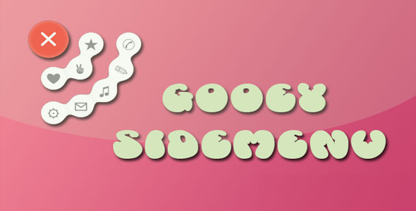
这是一款效果非常有创意的纯 CSS3 液态胶合效果的环形菜单按钮特效。该环行菜单按钮在用户点击主菜单按钮后,两行子菜单会以环状的方式打开,并且子菜单就像液体一样,能够胶合,具有弹性,效果非常炫酷。
HTML 结构
在 HTML 结构中,主菜单按钮使用 input[type='checkbox']的复选框和一个<label>元素来制作。子菜单按钮是一组<button>元素。
也想出现在这里?联系我们吧

<div class='wrap'>
<input type='checkbox' id='checking' style='display:none;' />
<button class='blob'>★</button>
<button class='blob'>✉</button>
<button class='blob'>⚙</button>
<button class='blob'>❤</button>
<button class='blob'>✌</button>
<button class='blob'>✎</button>
<button class='blob'>♫</button>
<button class='blob'>✆</button>
<label class='blob' for='checking'>
<span class='bar'></span>
<span class='bar'></span>
<span class='bar'></span>
</label>
</div>
该环形菜单的液态融合效果使用 SVG 过滤器来制作。在 SVG 过滤器中,有 3 个滤镜:第一个是高斯模糊滤镜,第二个是颜色矩阵滤镜,第三个是混合滤镜。混合滤镜可以将多个输入滤镜混合为一个。
<svg>
<defs>
<filter id="filt">
<feGaussianBlur in="SourceGraphic" result="blur" stdDeviation="10" />
<feColorMatrix in="blur" mode="matrix" values="1 0 0 0 0 0 1 0 0 0 0 0 1 0 0 0 0 0 18 -7" result="filt" />
<feBlend in2="filt" in="SourceGraphic" result="mix" />
</filter>
</defs>
</svg>
在这个效果中,颜色矩阵滤镜的输入是高斯模糊滤镜,然后混合滤镜将颜色矩阵的输出和源图像进行混合,制作液体融合效果。关于 SVG 滤镜的详细介绍,可以参考:SVG 进阶 | SVG 过滤器(SVG Filters)。
CSS 样式
在 CSS 样式中,需要注意的是引用 SVG 过滤器的方式。在非 webkit 内核的浏览器中,外连的 css 样式表中引用 SVG 过滤器需要写完整的路径,而如果是内联的 CSS 样式可以直接通过 ID 来引用。
filter: url("../index.html/#filt");
-webkit-filter: url("#filt");
主菜单按钮的点击时通过 checkbox hack 来实现的。
.wrap .blob[for="checking"] {
z-index: 30;
font-size: 60px;
text-align: center;
color: #fff;
transition: transform 0.5s ease-in-out 0.2s;
-webkit-transition: -webkit-transform 0.5s ease-in-out 0.2s;
-moz-transition: transform 0.5s ease-in-out 0.2s;
-o-transition: transform 0.5s ease-in-out 0.2s;
-ms-transition: transform 0.5s ease-in-out 0.2s;
}.wrap .blob:not([for="checking"]) {
width: 50px;
height: 50px;
top: 15px;
left: 15px;
font-size: 30px;
transition: all 0.5s ease-in-out;
-webkit-transition: all 0.5s ease-in-out;
-moz-transition: all 0.5s ease-in-out;
-o-transition: all 0.5s ease-in-out;
-ms-transition: all 0.5s ease-in-out;
}.wrap .blob:not([for="checking"]):hover {
color: #F44336;
animation: harlem 0.5s linear forwards;
-webkit-animation: harlem 0.5s linear forwards;
-moz-animation: harlem 0.5s linear forwards;
-o-animation: harlem 0.5s linear forwards;
-ms-animation: harlem 0.5s linear forwards;
}.wrap > #checking:checked ~ .blob:nth-child(2) {
margin-left: 85px;
margin-top: 10px;
background-color: #fff;
}.wrap > #checking:checked ~ .blob:nth-child(3) {
margin-top: 145px;
margin-left: 65px;
background-color: #fff;
}.wrap > #checking:checked ~ .blob:nth-child(4) {
margin-top: 160px;
margin-left: 10px;
background-color: #fff;
}.wrap > #checking:checked ~ .blob:nth-child(5) {
margin-top: 85px;
margin-left: 10px;
background-color: #fff;
}.wrap > #checking:checked ~ .blob:nth-child(6) {
margin-top: 63px;
margin-left: 63px;
background-color: #fff;
}.wrap > #checking:checked ~ .blob:nth-child(7) {
margin-top: 65px;
margin-left: 145px;
background-color: #fff;
}.wrap > #checking:checked ~ .blob:nth-child(8) {
margin-top: 112px;
margin-left: 112px;
background-color: #fff;
}.wrap > #checking:checked ~ .blob:nth-child(9) {
margin-top: 10px;
margin-left: 160px;
background-color: #fff;
}.wrap > #checking:checked ~ .blob[for="checking"] > .bar:nth-child(1) {
transform: rotate(45deg);
-webkit-transform: rotate(45deg);
-moz-transform: rotate(45deg);
-o-transform: rotate(45deg);
-ms-transform: rotate(45deg);
margin-top: 37px;
}.wrap > #checking:checked ~ .blob[for="checking"] > .bar:nth-child(2) {
transform: rotate(-45deg);
-webkit-transform: rotate(-45deg);
-moz-transform: rotate(-45deg);
-o-transform: rotate(-45deg);
-ms-transform: rotate(-45deg);
margin-top: -10px;
}.wrap > #checking:checked ~ .blob[for="checking"] > .bar:nth-child(3) {
opacity: 0;
}
harlem 帧动画是鼠标滑过子菜单时的 CSS 动画效果。完整的代码请参考下载文件。
| 演示地址 | 下载地址 |
专业提供WordPress主题安装、深度汉化、加速优化等各类网站建设服务,详询在线客服!
也想出现在这里?联系我们吧