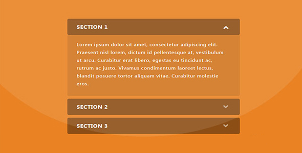
Tab选项卡
纯css3超酷tabs选项卡动画特效插件
 PetitQ
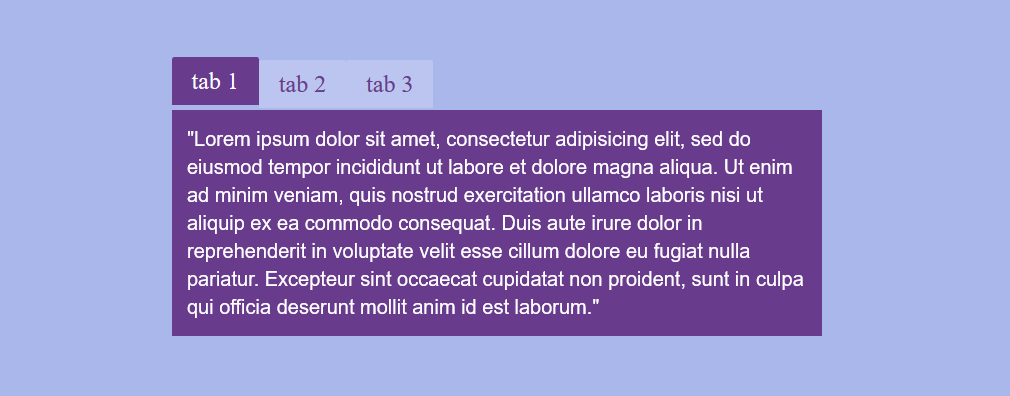
这是一款使用纯 css3 制作的超酷 tabs 选项卡动画特效插件。该 tabs 选项卡插件共有 5 种特效,分别是淡入淡出、弹性放大缩小、上下滑动、来回翻转等特效。自从 css3 被更多的浏览器所支持,以前许多用 javascript 才能完成的特效都被 css3 所替代。这款插件就是使用纯 css 制作出效果极酷的 tabs 选项特效。
HTML 结构
<ul class="tabs">
<li>
<input type="radio" checked name="tabs" id="tab1">
<label for="tab1">tab 1</label>
<div id="tab-content1" class="tab-content animated fadeIn">
...</div>
</li>
<li>
<input type="radio" name="tabs" id="tab2">
<label for="tab2">tab 2</label>
<div id="tab-content2" class="tab-content animated fadeIn">
...</div>
</li>
<li>
<input type="radio" name="tabs" id="tab3">
<label for="tab3">tab 3</label>
<div id="tab-content3" class="tab-content animated fadeIn">
...</div>
</li>
</ul>
也想出现在这里?联系我们吧

CSS 样式
body, html {
height: 100%;
margin: 0;
-webkit-font-smoothing: antialiased;
font-weight: 100;
background: #aadfeb;
text-align: center;
font-family: helvetica;
}.tabs input[type=radio] {
position: absolute;
top: -9999px;
left: -9999px;
}.tabs {
width: 650px;
float: none;
list-style: none;
position: relative;
padding: 0;
margin: 75px auto;
}.tabs li{
float: left;
}.tabs label {
display: block;
padding: 10px 20px;
border-radius: 2px 2px 0 0;
color: #08C;
font-size: 24px;
font-weight: normal;
font-family: 'Lily Script One', helveti;
background: rgba(255,255,255,0.2);
cursor: pointer;
position: relative;
top: 3px;
-webkit-transition: all 0.2s ease-in-out;
-moz-transition: all 0.2s ease-in-out;
-o-transition: all 0.2s ease-in-out;
transition: all 0.2s ease-in-out;
}.tabs label:hover {
background: rgba(255,255,255,0.5);
top: 0;
}[id^=tab]:checked + label {
background: #08C;
color: white;
top: 0;
}[id^=tab]:checked ~ [id^=tab-content] {
display: block;
}.tab-content{z-index: 2;
display: none;
text-align: left;
width: 100%;
font-size: 20px;
line-height: 140%;
padding-top: 10px;
background: #08C;
padding: 15px;
color: white;
position: absolute;
top: 53px;
left: 0;
box-sizing: border-box;
-webkit-animation-duration: 0.5s;
-o-animation-duration: 0.5s;
-moz-animation-duration: 0.5s;
animation-duration: 0.5s;
}
首先,为了实现 javascript 的功能,我们需要让 CSS 知道以后什么时候点击了按钮。如果是使用 javascript,我们可以简单的在按钮上添加一个"click" 的 class 用以操控按钮。在不适用 javascript 的情况下,我们使用了一个小技巧,隐藏 radio 按钮,radio 按钮通过 rel 属性链接到 label 上。当你点击了 label 的时候,实际上是点击了 radio 按钮。通过 lable 来触发 radio 按钮的“checked”属性,我们可以通过:checked 来控制它们。通过上面的 html 结构,你可以看到我们将 radio 按钮、label 和选项卡内容放在 DOM 的同一层上。这样做的原因,是为了方便使用“~”兄弟选择器来触发同一级别上的元素。在 demo 中,我们在 tabs 选项卡内容切换时添加了 Dan Eden 的 CSS animation library 来添加各种动画效果。
| 演示地址 | 下载地址 |
专业提供WordPress主题安装、深度汉化、加速优化等各类网站建设服务,详询在线客服!
也想出现在这里?联系我们吧