图片/图形
CSS3导航菜单背景模糊特效
 PetitQ

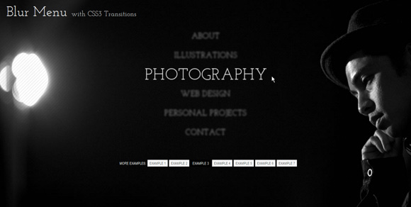
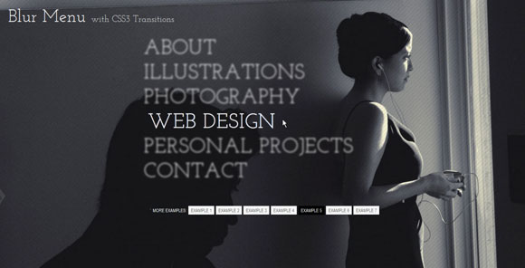
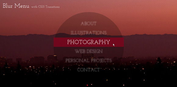
这是一款使用 css3 transition 属性制作的导航菜单背景模糊特效插件。这款插件共集合了 7 种不同的导航菜单背景模糊效果。其效果是当鼠标滑过菜单时,当前菜单项清晰显示,其余项变得模糊。
HTML 结构
7 个 demo 使用了相同的 html 结构:
也想出现在这里?联系我们吧

<ul class="bmenu">
<li><a href="#">About</a></li>
<li><a href="#">Illustrations</a></li>
<li><a href="#">Photography</a></li>
<li><a href="#">Web Design</a></li>
<li><a href="#">Personal Projects</a></li>
<li><a href="#">Contact</a></li>
</ul>
CSS 样式
通用 css 部分如下:
.bmenu{padding: 0px;
margin: 0 0 10px 0;
position: relative;
}.bmenu li{
font-size: 50px;
display: block;
}

在第一个 demo 中,我们希望菜单项在开始时是模糊的。为了做到这一点,我们给超链接元素透明的颜色和白色的文字阴影。并为所有的属性添加 transitions。
.bmenu li a{
color: transparent;
display: block;
text-transform: uppercase;
text-shadow: 0px 0px 5px #fff;
letter-spacing: 1px;
-webkit-transition: all 0.3s ease-in-out;
-moz-transition: all 0.3s ease-in-out;
-o-transition: all 0.3s ease-in-out;
-ms-transition: all 0.3s ease-in-out;
transition: all 0.3s ease-in-out;
}
当鼠标滑过某个菜单项时,我们希望它变得清晰,而其他项更模糊。在这里不能使用兄弟选择器来获取“其它”所有的菜单项,只能获取当前鼠标滑过菜单项后面的菜单项。所以在这里要使用一点小技巧,因为所有的菜单项都被设置为块级元素,因此可以简单的在鼠标 Hover 的时候将整个菜单都变得模糊,然后将当前项变清新即可。
.bmenu:hover li a{
text-shadow: 0px 0px 5px #0d1a3a;
}.bmenu li a:hover{
color: #fff;
text-shadow: 0px 0px 1px #fff;
padding-left: 10px;
}

在第二个 demo 中,鼠标 hover 时菜单项有些倾斜效果。我们将使用 2D transforms 来完成倾斜效果。倾斜的角度将被设置为 x 轴方向的-12 度。超链接的背景色使用 rgba 设置为半透明。还为文字添加一个稍微透明的文字阴影。
.bmenu li a{
display: block;
text-transform: uppercase;
text-shadow: 1px 1px 2px rgba(89,22,20,0.3);
color: #581514;
padding: 5px 20px;
margin: 2px;
background: rgba(255,255,255,0.2);
letter-spacing: 1px;
-webkit-transform: skew(-12deg);
-moz-transform: skew(-12deg);
-o-transform: skew(-12deg);
-ms-transform: skew(-12deg);
transform: skew(-12deg);
-webkit-transition: all 0.4s ease-in-out;
-moz-transition: all 0.4s ease-in-out;
-o-transition: all 0.4s ease-in-out;
-ms-transition: all 0.4s ease-in-out;
transition: all 0.4s ease-in-out;
}
鼠标滑过菜单项时,设置倾斜角度为 0,并通过设置半透明背景使菜单变得模糊,当前 hover 的菜单项没有背景:
.bmenu:hover li a{
color: transparent;
text-shadow: 0px 0px 10px #fff;
background: rgba(88,22,22,0.2);
-webkit-transform: skew(0deg);
-moz-transform: skew(0deg);
-o-transform: skew(0deg);
-ms-transform: skew(0deg);
transform: skew(0deg);
}.bmenu li a:hover{
background: transparent;
text-shadow: 1px 1px 10px rgba(89,22,20,0.6);
color: #581514;
}
第三个 demo 中文字大小做了些变化。开始时是菜单文字缩小、变模糊。我们将使用一个相当缓慢的线性转换:
.bmenu li a{
white-space: nowrap;
color: transparent;
display: block;
text-transform: uppercase;
text-align: center;
text-shadow: 0px 0px 6px #fff;
letter-spacing: 1px;
-moz-transform: scale(0.5);
-ms-transform: scale(0.5);
-o-transform: scale(0.5);
-webkit-transform: scale(0.5);
transform: scale(0.5);
-webkit-transition: all 0.6s linear;
-moz-transition: all 0.6s linear;
-o-transition: all 0.6s linear;
-ms-transition: all 0.6s linear;
transition: all 0.6s linear;
}
鼠标 hover 时其它所有项更模糊,当前项变清晰并放大:
.bmenu:hover li a{
text-shadow: 0px 0px 15px #fff;
}.bmenu li a:hover{
text-shadow: 0px 0px 1px #fff;
-moz-transform: scale(1);
-ms-transform: scale(1);
-o-transform: scale(1);
-webkit-transform: scale(1);
transform: scale(1);
}
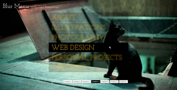
在这个 demo 中给超链接元素半透明的黑色背景和橙色的文字颜色。这个 demo 中将使用到 timing transition。
.bmenu li a{
display: block;
text-transform: uppercase;
text-shadow: 0px 0px 2px #eeb213;
color: #eeb213;
padding: 5px 20px;
margin: 2px;
background: rgba(0,0,0,0.7);
letter-spacing: 1px;
-webkit-transition: all 0.2s linear;
-moz-transition: all 0.2s linear;
-o-transition: all 0.2s linear;
-ms-transition: all 0.2s linear;
transition: all 0.2s linear;
}
当鼠标 hover 的时候,菜单项模糊,它们的背景色更加透明。当前 hover 项将不透明:我们通过指定一些时间延时来制作缩略图依次出现的效果:
.bmenu:hover li a{
text-shadow: 0px 0px 10px #eeb213;
color: transparent;
background: rgba(0,0,0,0.2);
}.bmenu li a:hover{
background: rgba(0,0,0,1.0);
text-shadow: 0px 0px 1px #eeb213;
}
第 5 个 demo 使用白色的文字阴影和文本颜色,我们只轻微的模糊菜单项元素:
.bmenu li a{
color: transparent;
display: block;
text-transform: uppercase;
text-shadow: 0px 0px 4px #fff;
letter-spacing: 1px;
-webkit-transition: all 0.2s ease-in-out;
-moz-transition: all 0.2s ease-in-out;
-o-transition: all 0.2s ease-in-out;
-ms-transition: all 0.2s ease-in-out;
transition: all 0.2s ease-in-out;
}
鼠标滑过时将使菜单项模糊一些并稍稍移动一点距离:
.bmenu:hover li a{
text-shadow: 0px 0px 6px #fff;
}.bmenu li a:hover{
color: #fff;
text-shadow: 0px 0px 1px #fff;
padding-left: 10px;
}

第 6 个 demo 设置背景色为半透明白色:
.bmenu li a{
white-space: nowrap;
display: block;
text-transform: uppercase;
text-shadow: 1px 1px 2px rgba(71,80,23,0.3);
color: #fff;
padding: 5px 20px;
margin: 2px;
background: rgba(255,255,255,0.2);
letter-spacing: 1px;
-webkit-transition: all 0.4s ease-in-out;
-moz-transition: all 0.4s ease-in-out;
-o-transition: all 0.4s ease-in-out;
-ms-transition: all 0.4s ease-in-out;
transition: all 0.4s ease-in-out;
}
使用 first-child 和 last-child 选择器为第一个和最后一个元素添加圆角:
.bmenu li:first-child a{
-webkit-border-radius: 15px 15px 0px 0px;
-moz-border-radius: 15px 15px 0px 0px;
border-radius: 15px 15px 0px 0px;
}.bmenu li:last-child a{
-webkit-border-radius: 0px 0px 15px 15px;
-moz-border-radius: 0px 0px 15px 15px;
border-radius: 0px 0px 15px 15px;
}
鼠标 hover 时其它元素模糊,当前元素变清晰,并且背景色变透明:
.bmenu:hover li a{
text-shadow: 0px 0px 10px #fff;
color: transparent;
}.bmenu li a:hover{
background: transparent;
text-shadow: 1px 1px 10px rgba(71,80,23,0.6);
color: #c4d85a;
}
最后一个 demo 通过设置 border radius 为宽高的一半将菜单变为圆形。
.bmenu{padding: 50px 0px;
margin: 0 auto;
position: relative;
background: rgba(0,0,0,0.7);
width: 500px;
height: 400px;
-webkit-border-radius: 250px;
-moz-border-radius: 250px;
border-radius: 250px;
-webkit-transition: background-color 0.5s ease-in-out;
-moz-transition: background-color 0.5s ease-in-out;
-o-transition: background-color 0.5s ease-in-out;
-ms-transition: background-color 0.5s ease-in-out;
transition: background-color 0.5s ease-in-out;
}
这里添加 transitions 是为了在鼠标滑过时背景有动画效果,通过 rgba 将背景变得更加透明:
.bmenu:hover{
background: rgba(0,0,0,0.2);
}
调整一下菜单项文字大小和行高:
.bmenu li{
font-size: 40px;
display: block;
line-height: 66px;
}
菜单项元素将被缩小和模糊:
.bmenu li a{
white-space: nowrap;
color: transparent;
display: block;
text-align: center;
text-transform: uppercase;
text-shadow: 0px 0px 3px #fff;
letter-spacing: 1px;
-moz-transform: scale(0.8);
-ms-transform: scale(0.8);
-o-transform: scale(0.8);
-webkit-transform: scale(0.8);
transform: scale(0.8);
-webkit-transition: all 0.4s linear;
-moz-transition: all 0.4s linear;
-o-transition: all 0.4s linear;
-ms-transition: all 0.4s linear;
transition: all 0.4s linear;
}
鼠标滑过时将使元素更加模糊,给当前 hover 元素一个好看的背景色,并使它的文字大小恢复到原来的尺寸:
.bmenu:hover li a{
text-shadow: 0px 0px 10px #fff;
}.bmenu li a:hover{
text-shadow: none;
color: #fff;
background: rgba(129,6,29,0.8);
-moz-transform: scale(1);
-ms-transform: scale(1);
-o-transform: scale(1);
-webkit-transform: scale(1);
transform: scale(1);
}
注意:某些 IE 浏览器不支持文字阴影效果,如果你实在需要,可以参考下面的文档:
CSS Blurred Text-Shadow in IE — Part I
IE Visual Filters and Transitions Reference: Static Filters
| 演示地址 | 下载地址 |
专业提供WordPress主题安装、深度汉化、加速优化等各类网站建设服务,详询在线客服!
也想出现在这里?联系我们吧