其他代码
超炫酷CSS3垂直时间轴特效
 PetitQ
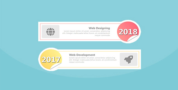
超炫酷 CSS3 垂直时间轴特效。该特效通过 HTML DOM 元素和 CSS transform 来制作非常炫酷的时间轴布局效果。
使用方法
在页面中引入 fontawesome.min.css 和 bootstrap.min.css 文件。
也想出现在这里?联系我们吧

<link href="dist/bootstrap.min.css" rel="stylesheet">
<link href="dist/fontawesome.min.css" rel="stylesheet">
HTML 结构
该垂直时间轴的 HTML DOM 元素结构如下:
<div class="container">
<div class="row">
<div class="col-md-12">
<div class="main-timeline">
<div class="timeline">
<a href="#" class="timeline-content">
<div class="timeline-icon">
<i class="fa fa-globe"></i>
</div>
<div class="inner-content">
<h3 class="title">Web Designing</h3>
<p class="description">
Lorem ipsum dolor ..</p>
</div>
<div class="timeline-year"><span>2018</span></div>
</a>
</div>
<div class="timeline">
<a href="#" class="timeline-content">
<div class="timeline-icon">
<i class="fa fa-rocket"></i>
</div>
<div class="inner-content">
<h3 class="title">Web Development</h3>
<p class="description">
Lorem ipsum dolor sit amet,..</p>
</div>
<div class="timeline-year"><span>2017</span></div>
</a>
</div>
</div>
</div>
</div>
</div>
CSS 样式
然后通过下面的 CSS 样式来制作垂直时间轴效果。
.main-timeline{
font-family: 'Roboto', sans-serif;
padding: 20px 100px;
overflow: hidden;
position: relative;
}.main-timeline .timeline{
background-color: #fff;
padding: 20px 70px 20px 20px;
margin-bottom: 70px;
border-radius: 0 100px 100px 0;
position: relative;
display: inline-block;
z-index: 1;
}.main-timeline .timeline:before{
content: '';
background-color: #fff;
height: 240px;
width: 240px;
border-radius: 50%;
transform: translateY(-50%);
position: absolute;
right: 0;
top: 50%;
}.main-timeline .timeline-content{
color: #000;
text-align: right;
width: 95%;
min-height: 160px;
padding: 30px 170px 30px 180px;
border: 2px solid #FD8881;
display: block;
float: left;
position: relative;
}.main-timeline .timeline-content:hover{ text-decoration: none; }
.main-timeline .timeline-icon{
color: #808080;
background-color: #e7e7e7;
font-size: 80px;
text-align: center;
line-height: 130px;
height: 130px;
width: 160px;
border-radius: 10px;
transform: translateY(-50%);
position: absolute;
left: 13px;
top: 50%;
}.main-timeline .title{
color: #808080;
text-transform: capitalize;
font-size: 25px;
font-weight: 600;
margin: 0 0 5px;
}.main-timeline .description{
color: rgba(0,0,0,0.5);
font-size: 15px;
letter-spacing: 1px;
margin: 0;
}.main-timeline .timeline-year{
color: #fff;
background: linear-gradient(60deg,#FF9389,#FF4E68);
font-size: 70px;
font-weight: 600;
text-align: center;
text-shadow: 2px 2px 5px #000;
line-height: 200px;
height: 200px;
width: 200px;
border-radius: 50%;
overflow: hidden;
transform: translateY(-50%);
position: absolute;
right: -95px;
top: 50%;
}.main-timeline .timeline-year:before,
.main-timeline .timeline-year:after{
content: '';
height: 190px;
width: 190px;
background-color: #fff;
border-radius: 50%;
position: absolute;
left: 85px;
top: 135px;
}.main-timeline .timeline-year:after{
border-radius: 0;
transform: rotate(58deg);
top: 144px;
left: 116px;
box-shadow: 0 0 8px #000;
}.main-timeline .timeline:nth-child(even){
border-radius: 100px 0 0 100px;
padding: 20px 20px 20px 70px;
}.main-timeline .timeline:nth-child(even) .timeline-icon{
left: auto;
right: 13px;
}.main-timeline .timeline:nth-child(even) .timeline-content{
padding: 20px 180px 20px 170px;
text-align: left;
float: right;
}.main-timeline .timeline:nth-child(even):before{
right: auto;
left: 0;
}.main-timeline .timeline:nth-child(even) .timeline-year{
right: auto;
left: -95px;
}.main-timeline .timeline:nth-child(4n+2) .timeline-content{ border-color: #FDCC4C; }
.main-timeline .timeline:nth-child(4n+2) .timeline-year{
background: linear-gradient(60deg,#FDCC4C,#FFF68D);
}.main-timeline .timeline:nth-child(4n+3) .timeline-content{ border-color: #ADEEC3; }
.main-timeline .timeline:nth-child(4n+3) .timeline-year{
background: linear-gradient(60deg,#ADEEC3,#83C796);
}.main-timeline .timeline:nth-child(4n+4) .timeline-content{ border-color: #7AB8DD; }
.main-timeline .timeline:nth-child(4n+4) .timeline-year{
background: linear-gradient(60deg,#7AB8DD,#A9E3F7);
}@media screen and (max-width:1200px){
.main-timeline{ padding: 20px 0 0; }
}@media screen and (max-width:990px){
.main-timeline{ padding: 20px 0 0 0; }
.main-timeline .timeline:nth-child(even),
.main-timeline .timeline{
border-radius: 0;
padding: 20px;
margin: 0 100px 60px 0;
}.main-timeline .timeline:nth-child(even){ margin: 0 0 60px 100px; }
.main-timeline .timeline:nth-child(even) .timeline-content,
.main-timeline .timeline-content{
padding: 20px 120px 20px 190px;
}.main-timeline .timeline:nth-child(even) .timeline-content{ padding: 20px 190px 20px 120px; }
.main-timeline .timeline:before{ right: -100px; }
.main-timeline .timeline-year{
right: -130px;
}.main-timeline .timeline:nth-child(even):before{ left: -100px; }
.main-timeline .timeline:nth-child(even) .timeline-year{
left: -130px;
}}@media screen and (max-width:767px){
.main-timeline{ padding: 70px 0 0; }
.main-timeline .timeline:nth-child(even),
.main-timeline .timeline{
border-radius: 0;
padding: 15px;
margin: 0 0 100px;
}.main-timeline .timeline:nth-child(even) .timeline-content,
.main-timeline .timeline-content{
padding: 100px 30px 20px;
text-align: center;
width: 100%;
}.main-timeline .timeline-icon{ display: none; }
.main-timeline .timeline:nth-child(even):before,
.main-timeline .timeline:before{
display: block;
right: 50%;
top: -70px;
transform: translateY(0) translateX(50%);
height: 180px;
width: 180px;
}.main-timeline .timeline:nth-child(even):before{
left: 50%;
transform: translateY(0) translateX(-50%);
}.main-timeline .timeline:nth-child(even) .timeline-year,
.main-timeline .timeline-year{
right: 50%;
top: -70px;
transform: translateY(0) translateX(50%);
height: 150px;
width: 150px;
line-height: 150px;
font-size: 50px;
}.main-timeline .timeline-year:before{
left: 30px;
top: 100px;
}.main-timeline .timeline-year:after{
left: 65px;
top: 106px;
transform: rotate(67deg);
}.main-timeline .timeline:nth-child(even) .timeline-year{
left: 50%;
transform: translateY(0) translateX(-50%);
}}
| 演示地址 | 下载地址 |
专业提供WordPress主题安装、深度汉化、加速优化等各类网站建设服务,详询在线客服!
也想出现在这里?联系我们吧