表单/表格
错误摇晃登录注册表单jQuery特效
 PetitQ
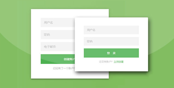
这是一款带摇晃特效的扁平风格登录注册表单界面设计。该登录注册表单界面简洁大方,通过滑动来切换用户登录和用户注册界面,并且在验证用户信息出错时,整个表单界面会有左右摇晃的动画效果。
HTML 结构
该扁平风格登录注册表单界面的 HTML 结构如下:
也想出现在这里?联系我们吧

<div id="wrapper" class="login-page">
<div id="login_form" class="form">
<form class="register-form">
<input type="text" placeholder="用户名" id="r_user_name"/>
<input type="password" placeholder="密码" id="r_password" />
<input type="text" placeholder="电子邮件" id="r_emial"/>
<button id="create">创建账户</button>
<p class="message">已经有了一个账户? <a href="#">立刻登录</a></p>
</form>
<form class="login-form">
<input type="text" placeholder="用户名" id="user_name"/>
<input type="password" placeholder="密码" id="password"/>
<button id="login">登 录</button>
<p class="message">还没有账户? <a href="#">立刻创建</a></p>
</form>
</div>
</div>
CSS 样式
为表单添加下面的必要 CSS 样式:
@import url(https://fonts.googleapis.com/css?family=Roboto:300);
.login-page {
width: 360px;
padding: 8% 0 0;
margin: auto;
}.form {
position: relative;
z-index: 1;
background: #FFFFFF;
max-width: 360px;
margin: 0 auto 100px;
padding: 45px;
text-align: center;
box-shadow: 0 0 20px 0 rgba(0, 0, 0, 0.2), 0 5px 5px 0 rgba(0, 0, 0, 0.24);
}.form input {
font-family: "Roboto", sans-serif;
outline: 0;
background: #f2f2f2;
width: 100%;
border: 0;
margin: 0 0 15px;
padding: 15px;
box-sizing: border-box;
font-size: 14px;
}.form button {
font-family: "Microsoft YaHei","Roboto", sans-serif;
text-transform: uppercase;
outline: 0;
background: #4CAF50;
width: 100%;
border: 0;
padding: 15px;
color: #FFFFFF;
font-size: 14px;
-webkit-transition: all 0.3 ease;
transition: all 0.3 ease;
cursor: pointer;
}.form button:hover,.form button:active,.form button:focus {
background: #43A047;
}.form .message {
margin: 15px 0 0;
color: #b3b3b3;
font-size: 12px;
}.form .message a {
color: #4CAF50;
text-decoration: none;
}.form .register-form {
display: none;
}.container {
position: relative;
z-index: 1;
max-width: 300px;
margin: 0 auto;
}.container:before, .container:after {
content: "";
display: block;
clear: both;
}.container .info {
margin: 50px auto;
text-align: center;
}.container .info h1 {
margin: 0 0 15px;
padding: 0;
font-size: 36px;
font-weight: 300;
color: #1a1a1a;
}.container .info span {
color: #4d4d4d;
font-size: 12px;
}.container .info span a {
color: #000000;
text-decoration: none;
}.container .info span .fa {
color: #EF3B3A;
}body {background: #76b852; /* fallback for old browsers */
background: -webkit-linear-gradient(right, #76b852, #8DC26F);
background: -moz-linear-gradient(right, #76b852, #8DC26F);
background: -o-linear-gradient(right, #76b852, #8DC26F);
background: linear-gradient(to left, #76b852, #8DC26F);
font-family: "Roboto", sans-serif;
-webkit-font-smoothing: antialiased;
-moz-osx-font-smoothing: grayscale;
}
表单左右摇晃的效果使用 CSS3 animation 动画来实现:
.shake_effect{-webkit-animation-name: shake;
animation-name: shake;
-webkit-animation-duration: 1s;
animation-duration: 1s;
}@-webkit-keyframes shake {
from, to {
-webkit-transform: translate3d(0, 0, 0);
transform: translate3d(0, 0, 0);
}10%, 30%, 50%, 70%, 90% {
-webkit-transform: translate3d(-10px, 0, 0);
transform: translate3d(-10px, 0, 0);
}20%, 40%, 60%, 80% {
-webkit-transform: translate3d(10px, 0, 0);
transform: translate3d(10px, 0, 0);
}}@keyframes shake {
from, to {
-webkit-transform: translate3d(0, 0, 0);
transform: translate3d(0, 0, 0);
}10%, 30%, 50%, 70%, 90% {
-webkit-transform: translate3d(-10px, 0, 0);
transform: translate3d(-10px, 0, 0);
}20%, 40%, 60%, 80% {
-webkit-transform: translate3d(10px, 0, 0);
transform: translate3d(10px, 0, 0);
}}
JavaScript
该特效中只是简单的对表单进行了一些验证,实际应用中你可以使用一些表单验证插件来对表单进行验证。在 jQuery 代码中,有两个用于验证的方法:check_login()和 check_register(),分别用于验证用户登录和用户注册。
function check_login(){
var name=$("#user_name").val();
var pass=$("#password").val();
if(name=="www.htmleaf.com" && pass=="www.htmleaf.com"){
alert("登录成功!");
$("#user_name").val("");
$("#password").val("");
}else{
$("#login_form").removeClass('shake_effect');
setTimeout(function()
{$("#login_form").addClass('shake_effect')
},1);
}}function check_register(){
var name = $("#r_user_name").val();
var pass = $("#r_password").val();
var email = $("r_email").val();
if(name!="" && pass=="" && email != "")
{alert("注册成功!");
$("#user_name").val("");
$("#password").val("");
}else{$("#login_form").removeClass('shake_effect');
setTimeout(function()
{$("#login_form").addClass('shake_effect')
},1);
}}
在用户点击登录和注册按钮时分别执行以上两个函数。
$("#create").click(function(){
check_register();
return false;
})
$("#login").click(function(){
check_login();
return false;
})
最后,表单的切换通过 jQuery 的 animate()方法来实现:
$('.message a').click(function () {
$('form').animate({
height: 'toggle',
opacity: 'toggle'
}, 'slow');
});
| 演示地址 | 下载地址 |
专业提供WordPress主题安装、深度汉化、加速优化等各类网站建设服务,详询在线客服!
也想出现在这里?联系我们吧