图片/图形
带方向感知的鼠标悬停图片动画CSS3特效
 PetitQ
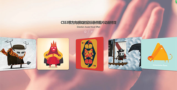
这是一款 CSS3 带方向感知的鼠标悬停图片动画特效。该特效在鼠标悬停到一组图片上面时,图片会根据鼠标所在位置发生旋转,并且旋转的角度始终根据鼠标所在位置而变化。
HTML 结构
<div class="cards-container">
<div class="card"></div>
<div class="card"></div>
<div class="card"></div>
<div class="card"></div>
<div class="card"></div>
</div>
也想出现在这里?联系我们吧

CSS 样式
* {
box-sizing: border-box;
}body {background-image: url('../img/bg.jpg');
background-size: cover;
background-position: center center;
display: flex;
flex-direction: column;
font-family: 'Muli';
justify-content: center;
align-items: center;
height: 100vh;
text-align: center;
}.cards-container {
display: flex;
justify-content: center;
perspective: 1000px;
width: 100%;
}.cards-container:hover .card {
transform: rotateY(30deg);
}.card {
background-repeat: no-repeat;
background-size: cover;
background-position: center center;
border-radius: 15px;
box-shadow: 0 2px 5px rgba(0, 0, 0, 0.5);
margin: 20px;
height: 300px;
transition: transform 0.2s ease-in-out;
width: 20%;
min-width: 100px;
}.card:hover {
transform: rotateY(0deg) !important;
}.card:hover ~ .card {
transform: rotateY(-30deg);
}.card:nth-of-type(1) {
background-image: url('../img/1.jpg');
}.card:nth-of-type(2) {
background-image: url('../img/2.jpg');
}.card:nth-of-type(3) {
background-image: url('../img/3.jpg');
}.card:nth-of-type(4) {
background-image: url('../img/4.jpg');
}.card:nth-of-type(5) {
background-image: url('../img/5.jpg');
}@media screen and (max-width: 756px) {
.card:nth-of-type(4), .card:nth-of-type(5) {
display: none;
}}/* SOCIAL PANEL CSS */.social-panel-container {
position: fixed;
right: 0;
bottom: 80px;
transform: translateX(100%);
transition: transform 0.4s ease-in-out;
}.social-panel-container.visible {
transform: translateX(-10px);
}.social-panel {
background-color: #fff;
border-radius: 16px;
box-shadow: 0 16px 31px -17px rgba(0,31,97,0.6);
border: 5px solid #001F61;
display: flex;
flex-direction: column;
justify-content: center;
align-items: center;
font-family: 'Muli';
position: relative;
height: 169px;
width: 370px;
max-width: calc(100% - 10px);
}.social-panel button.close-btn {
border: 0;
color: #97A5CE;
cursor: pointer;
font-size: 20px;
position: absolute;
top: 5px;
right: 5px;
}.social-panel button.close-btn:focus {
outline: none;
}.social-panel p {
background-color: #001F61;
border-radius: 0 0 10px 10px;
color: #fff;
font-size: 14px;
line-height: 18px;
padding: 2px 17px 6px;
position: absolute;
top: 0;
left: 50%;
margin: 0;
transform: translateX(-50%);
text-align: center;
width: 235px;
}.social-panel p i {
margin: 0 5px;
}.social-panel p a {
color: #FF7500;
text-decoration: none;
}.social-panel h4 {
margin: 20px 0;
color: #97A5CE;
font-family: 'Muli';
font-size: 14px;
line-height: 18px;
text-transform: uppercase;
}.social-panel ul {
display: flex;
list-style-type: none;
padding: 0;
margin: 0;
}.social-panel ul li {
margin: 0 10px;
}.social-panel ul li a {
border: 1px solid #DCE1F2;
border-radius: 50%;
color: #001F61;
font-size: 20px;
display: flex;
justify-content: center;
align-items: center;
height: 50px;
width: 50px;
text-decoration: none;
}.social-panel ul li a:hover {
border-color: #FF6A00;
box-shadow: 0 9px 12px -9px #FF6A00;
}.floating-btn {
border-radius: 26.5px;
background-color: #001F61;
border: 1px solid #001F61;
box-shadow: 0 16px 22px -17px #03153B;
color: #fff;
cursor: pointer;
font-size: 16px;
line-height: 20px;
padding: 12px 20px;
position: fixed;
bottom: 20px;
right: 20px;
z-index: 999;
}.floating-btn:hover {
background-color: #ffffff;
color: #001F61;
}.floating-btn:focus {
outline: none;
}@media screen and (max-width: 480px) {
.social-panel-container.visible {
transform: translateX(0px);
}.floating-btn {
right: 10px;
}}
Codepen 网址:https://codepen.io/FlorinPop17/pen/LYPBQKy
| 演示地址 | 下载地址 |
专业提供WordPress主题安装、深度汉化、加速优化等各类网站建设服务,详询在线客服!
也想出现在这里?联系我们吧