Tab选项卡
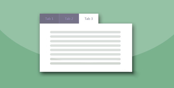
简约时尚的纯CSS3 Tabs选项卡特效
 PetitQ
这是一款使用纯 CSS3 制作的 Tabs 选项卡特效。该 Tabs 选项卡简约时尚,各个选项卡之间切换时使用了下划线跟随动画,整体效果非常不错。
HTML 结构
整个 Tabs 选项卡的 HTML 结构分为几个部分:使用<input>元素和一个无序列表来制作导航。
也想出现在这里?联系我们吧

<input type="radio" id="tab1" name="tab-control" checked>
<input type="radio" id="tab2" name="tab-control">
<input type="radio" id="tab3" name="tab-control">
<input type="radio" id="tab4" name="tab-control">
<ul>
<li title="tab 1"><label for="tab1" role="button"><span>Tab 1</span></label></li>
<li title="tab 2"><label for="tab2" role="button"><span>Tab 2</span></label></li>
<li title="tab 3"><label for="tab3" role="button"><span>Tab 3</span></label></li>
<li title="tab 4"><label for="tab4" role="button"><span>Tab 4</span></label></li>
</ul>
各个选项卡的内容包含在一个<div>元素中。
<div class="content">
<section>
<h2>Tab 1 content</h2>
</section>
<section>
<h2>Tab 2 content</h2>
</section>
<section>
<h2>Tab 3 content</h2>
</section>
<section>
<h2>Tab 4 content</h2>
</section>
</div>
用于制作下划线动画的线条使用一个<div>元素来制作。
<div class="slider"><div class="indicator"></div></div>
CSS 样式
该 Tabs 选项卡的主要 CSS 样式如下:
.tabs {
left: 50%;
-webkit-transform: translateX(-50%);
transform: translateX(-50%);
position: relative;
background: white;
padding: 50px;
padding-bottom: 80px;
width: 70%;
height: 250px;
box-shadow: 0 14px 28px rgba(0, 0, 0, 0.25), 0 10px 10px rgba(0, 0, 0, 0.22);
border-radius: 5px;
min-width: 240px;
}.tabs input[name="tab-control"] { display: none; }
.tabs .content section h2, .tabs ul li label {
font-weight: bold;
font-size: 18px;
color: #428BFF;
}.tabs ul {
list-style-type: none;
padding-left: 0;
display: -webkit-box;
display: -webkit-flex;
display: -ms-flexbox;
display: flex;
-webkit-box-orient: horizontal;
-webkit-box-direction: normal;
-webkit-flex-direction: row;
-ms-flex-direction: row;
flex-direction: row;
margin-bottom: 10px;
-webkit-box-pack: justify;
-webkit-justify-content: space-between;
-ms-flex-pack: justify;
justify-content: space-between;
-webkit-box-align: end;
-webkit-align-items: flex-end;
-ms-flex-align: end;
align-items: flex-end;
-webkit-flex-wrap: wrap;
-ms-flex-wrap: wrap;
flex-wrap: wrap;
}.tabs ul li {
box-sizing: border-box;
-webkit-box-flex: 1;
-webkit-flex: 1;
-ms-flex: 1;
flex: 1;
width: 25%;
padding: 0 10px;
text-align: center;
}.tabs ul li label {
-webkit-transition: all 0.3s ease-in-out;
transition: all 0.3s ease-in-out;
color: #929daf;
padding: 5px auto;
overflow: hidden;
text-overflow: ellipsis;
display: block;
cursor: pointer;
-webkit-transition: all 0.2s ease-in-out;
transition: all 0.2s ease-in-out;
white-space: nowrap;
-webkit-touch-callout: none;
-webkit-user-select: none;
-moz-user-select: none;
-ms-user-select: none;
user-select: none;
}.tabs ul li label br { display: none; }
.tabs ul li label svg {
fill: #929daf;
height: 1.2em;
vertical-align: bottom;
margin-right: 0.2em;
-webkit-transition: all 0.2s ease-in-out;
transition: all 0.2s ease-in-out;
}.tabs ul li label:hover, .tabs ul li label:focus, .tabs ul li label:active {
outline: 0;
color: #bec5cf;
}.tabs ul li label:hover svg, .tabs ul li label:focus svg, .tabs ul li label:active svg { fill: #bec5cf; }
.tabs .slider {
position: relative;
width: 25%;
-webkit-transition: all 0.33s cubic-bezier(0.38, 0.8, 0.32, 1.07);
transition: all 0.33s cubic-bezier(0.38, 0.8, 0.32, 1.07);
}.tabs .slider .indicator {
position: relative;
width: 50px;
max-width: 100%;
margin: 0 auto;
height: 4px;
background: #428BFF;
border-radius: 1px;
}.tabs .content { margin-top: 30px; }
.tabs .content section {
display: none;
-webkit-animation-name: content;
animation-name: content;
-webkit-animation-direction: normal;
animation-direction: normal;
-webkit-animation-duration: 0.3s;
animation-duration: 0.3s;
-webkit-animation-timing-function: ease-in-out;
animation-timing-function: ease-in-out;
-webkit-animation-iteration-count: 1;
animation-iteration-count: 1;
line-height: 1.4;
}.tabs .content section h2 {
color: #428BFF;
display: none;
}.tabs .content section h2::after {
content: "";
position: relative;
display: block;
width: 30px;
height: 3px;
background: #428BFF;
margin-top: 5px;
left: 1px;
}.tabs input[name="tab-control"]:nth-of-type(1):checked ~ ul > li:nth-child(1) > label {
cursor: default;
color: #428BFF;
}.tabs input[name="tab-control"]:nth-of-type(1):checked ~ ul > li:nth-child(1) > label svg { fill: #428BFF; }
@media (max-width: 600px) {
.tabs input[name="tab-control"]:nth-of-type(1):checked ~ ul > li:nth-child(1) > label { background: rgba(0, 0, 0, 0.08); }
}.tabs input[name="tab-control"]:nth-of-type(1):checked ~ .slider {
-webkit-transform: translateX(0%);
transform: translateX(0%);
}.tabs input[name="tab-control"]:nth-of-type(1):checked ~ .content > section:nth-child(1) { display: block; }
.tabs input[name="tab-control"]:nth-of-type(2):checked ~ ul > li:nth-child(2) > label {
cursor: default;
color: #428BFF;
}.tabs input[name="tab-control"]:nth-of-type(2):checked ~ ul > li:nth-child(2) > label svg { fill: #428BFF; }
@media (max-width: 600px) {
.tabs input[name="tab-control"]:nth-of-type(2):checked ~ ul > li:nth-child(2) > label { background: rgba(0, 0, 0, 0.08); }
}.tabs input[name="tab-control"]:nth-of-type(2):checked ~ .slider {
-webkit-transform: translateX(100%);
transform: translateX(100%);
}.tabs input[name="tab-control"]:nth-of-type(2):checked ~ .content > section:nth-child(2) { display: block; }
.tabs input[name="tab-control"]:nth-of-type(3):checked ~ ul > li:nth-child(3) > label {
cursor: default;
color: #428BFF;
}.tabs input[name="tab-control"]:nth-of-type(3):checked ~ ul > li:nth-child(3) > label svg { fill: #428BFF; }
@media (max-width: 600px) {
.tabs input[name="tab-control"]:nth-of-type(3):checked ~ ul > li:nth-child(3) > label { background: rgba(0, 0, 0, 0.08); }
}.tabs input[name="tab-control"]:nth-of-type(3):checked ~ .slider {
-webkit-transform: translateX(200%);
transform: translateX(200%);
}.tabs input[name="tab-control"]:nth-of-type(3):checked ~ .content > section:nth-child(3) { display: block; }
.tabs input[name="tab-control"]:nth-of-type(4):checked ~ ul > li:nth-child(4) > label {
cursor: default;
color: #428BFF;
}.tabs input[name="tab-control"]:nth-of-type(4):checked ~ ul > li:nth-child(4) > label svg { fill: #428BFF; }
@media (max-width: 600px) {
.tabs input[name="tab-control"]:nth-of-type(4):checked ~ ul > li:nth-child(4) > label { background: rgba(0, 0, 0, 0.08); }
}.tabs input[name="tab-control"]:nth-of-type(4):checked ~ .slider {
-webkit-transform: translateX(300%);
transform: translateX(300%);
}.tabs input[name="tab-control"]:nth-of-type(4):checked ~ .content > section:nth-child(4) { display: block; }
@-webkit-keyframes
content { from {
opacity: 0;
-webkit-transform: translateY(5%);
transform: translateY(5%);
}to {opacity: 1;
-webkit-transform: translateY(0%);
transform: translateY(0%);
}}@keyframes
content { from {
opacity: 0;
-webkit-transform: translateY(5%);
transform: translateY(5%);
}to {opacity: 1;
-webkit-transform: translateY(0%);
transform: translateY(0%);
}}@media (max-width: 1000px) {
.tabs ul li label { white-space: initial; }
.tabs ul li label br { display: initial; }
.tabs ul li label svg { height: 1.5em; }
}@media (max-width: 600px) {
.tabs ul li label {
padding: 5px;
border-radius: 5px;
}.tabs ul li label span { display: none; }
.tabs .slider { display: none; }
.tabs .content { margin-top: 20px; }
.tabs .content section h2 { display: block; }
}
| 演示地址 | 下载地址 |
专业提供WordPress主题安装、深度汉化、加速优化等各类网站建设服务,详询在线客服!
也想出现在这里?联系我们吧