对话框/Tips
CSS3消息提示动画效果
 PetitQ
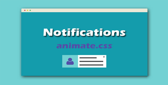
这是一款基于 animate.css 的效果非常酷的 CSS 消息提示动画效果。这 66 种 CSS 消息提示动画效果按出现位置分为 4 种类型:上部、中部、中下和右下。每个部位的消息提示效果都是不一样的。这 66 种 CSS 消息提示动画效果按出现位置分为 4 种类型:上部、中部、中下和右下。每个部位的消息提示效果都是不一样的。注意:这个 CSS 消息提示动画效果需要在支持 CSS3 的浏览器中才能正常工作。
HTML 结构
该 CSS 消息提示动画效果的 HTML 结构非常简单。使用一个 id 为#notifications 的 div 作为整个包裹容器。
也想出现在这里?联系我们吧

<div id="notifications"></div>
消息提示框的代码默认情况下是不存在与 DOM 中的,它们使用 js 来动态插入。例如当选择"Top"选项时,在点击触发按钮后,Top 消息提示框将使用 js 插入到 DOM 中:
<div id="notifications-top-center">
<span class="iconb" data-icon=""></span>
Oups something went wrong !<div id="notifications-top-center-close" class="close">
<span class="iconb" data-icon=""></span>
</div>
</div>
对于中部、中下和右下几个部位的消息提示框也是相同的操作。它们默认是不存在与 DOM 中的,只有在触发了相应的事件时,才使用 jQuery 来将 HTML 代码插入到 DOM 中的相应位置上。
<div id="notifications-full">
<div id="notifications-full-close" class="close"><span class="iconb" data-icon=""></span></div>
<div id="notifications-full-icon"><span class="iconb" data-icon=""></span></div>
<div id="notifications-full-text">...</div>
</div>
<div id="notifications-bottom-center-tab">
<div id="notifications-bottom-center-tab-close" class="close"><span class="iconb" data-icon=""></span></div>
<div id="notifications-bottom-center-tab-avatar"><img src="_assets/avatar.png" width="100" height="100" /></div>
<div id="notifications-bottom-center-tab-right">
<div id="notifications-bottom-center-tab-right-title"><span>delmarks</span> sent you a message</div>
<div id="notifications-bottom-center-tab-right-text">...</div>
</div>
</div>
<div id="notifications-bottom-right-tab">
<div id="notifications-bottom-right-tab-close" class="close"><span class="iconb" data-icon=""></span></div>
<div id="notifications-bottom-right-tab-avatar"><img src="_assets/avatar.png" width="70" height="70" /></div>
<div id="notifications-bottom-right-tab-right">
<div id="notifications-bottom-right-tab-right-title"><span>delmarks</span> sent you a message</div>
<div id="notifications-bottom-right-tab-right-text">...</div>
</div>
</div>
CSS 样式
该 CSS 消息提示动画效果有两个主要的 CSS 文件。一个是 animate.css 文件,用于产生各种动画效果。另一个是 animated-notifications.css 文件。在实际使用时,你需要在 animate.css 文件中查找你需要的 class 动画名称。下面是主要的消息提示框定位 CSS 代码:
#notifications-bottom-right {
position: absolute;
width: 360px;
right: 20px;
bottom: 20px;
}#notifications-bottom-right-tab{
background-color: rgba(255,255,255,1);
float: left;
height: 100px;
width: 360px;
margin-top: 20px;
position: relative;
-moz-box-shadow: 0px 0px 10px rgba(0,0,0,0.1);
-webkit-box-shadow: 0px 0px 10px rgba(0,0,0,0.1);
box-shadow: 0px 0px 10px rgba(0,0,0,0.1);
}#notifications-bottom-right-tab-close{
height: 20px;
width: 20px;
position: absolute;
top: 40px;
right: 20px;
color: #cccccc;
font-size: 18px;
line-height: 20px;
text-align: center;
-webkit-transition: all 0.5s;
-moz-transition: all 0.5s;
-o-transition: all 0.5s;
transition: all 0.5s;
}#notifications-bottom-right-tab-close:hover {
color: rgba(102,102,102,1);
cursor: pointer;
}#notifications-bottom-right-tab-avatar{
float: left;
height: 100px;
width: 70px;
margin-left: 20px;
}#notifications-bottom-right-tab-avatar img{
-moz-border-radius: 50% 50% 50% 50%;
-webkit-border-radius: 50% 50% 50% 50%;
border-radius: 50% 50% 50% 50%;
-khtml-border-radius: 50% 50% 50% 50%;
float: left;
margin-top: 15px;
}#notifications-bottom-right-tab-right{
float: left;
width: 210px;
margin-left: 20px;
margin-top: 20px;
}#notifications-bottom-right-tab-right-title{
float: left;
width: 100%;
color: #252525;
font-weight: 600;
}#notifications-bottom-right-tab-right-title span{
color: #e91e63;
}#notifications-bottom-right-tab-right-text{
float: left;
width: 100%;
font-size: 14px;
color: #4c4c4c;
font-style: italic;
margin-top: 5px;
}#notifications-bottom-center{
position: absolute;
width: 360px;
bottom: 90px;
left: 50%;
margin-left: -180px;
}#notifications-bottom-center-tab{
background-color: rgba(255,255,255,1);
float: left;
height: 100px;
width: 360px;
margin-top: 20px;
position: relative;
-moz-box-shadow: 0px 0px 10px rgba(0,0,0,0.1);
-webkit-box-shadow: 0px 0px 10px rgba(0,0,0,0.1);
box-shadow: 0px 0px 10px rgba(0,0,0,0.1);
}#notifications-bottom-center-tab-close{
height: 20px;
width: 20px;
position: absolute;
top: 40px;
right: 20px;
color: #cccccc;
font-size: 18px;
line-height: 20px;
text-align: center;
-webkit-transition: all 0.5s;
-moz-transition: all 0.5s;
-o-transition: all 0.5s;
transition: all 0.5s;
}#notifications-bottom-center-tab-close:hover {
color: rgba(102,102,102,1);
cursor: pointer;
}#notifications-bottom-center-tab-avatar{
float: left;
height: 100px;
width: 100px;
}#notifications-bottom-center-tab-avatar img{
float: left;
}#notifications-bottom-center-tab-right{
float: left;
width: 210px;
margin-left: 20px;
margin-top: 20px;
}#notifications-bottom-center-tab-right-title{
float: left;
width: 100%;
color: #252525;
font-weight: 600;
}#notifications-bottom-center-tab-right-title span{
color: #e91e63;
}#notifications-bottom-center-tab-right-text{
float: left;
width: 100%;
font-size: 14px;
color: #4c4c4c;
font-style: italic;
margin-top: 5px;
}#notifications-top-center {
position: fixed;
left: 0px;
top: 0px;
width: 100%;
background-color: rgba(255,255,255,1);
height: 50px;
text-align: center;
line-height: 50px;
color: #404040;
font-size: 18px;
font-weight: 600;
}#notifications-top-center-close {
background-color: rgba(233,30,99,0.6);
float: right;
height: 50px;
width: 50px;
font-size: 30px;
color: rgba(255,255,255,1);
font-weight: 400;
-webkit-transition: all 0.5s;
-moz-transition: all 0.5s;
-o-transition: all 0.5s;
transition: all 0.5s;
}#notifications-top-center-close:hover {
cursor: pointer;
background-color: rgba(233,30,99,1);
}#notifications-full{
-moz-box-shadow: 0px 0px 50px rgba(0,0,0,0.1);
-webkit-box-shadow: 0px 0px 50px rgba(0,0,0,0.1);
box-shadow: 0px 0px 50px rgba(0,0,0,0.1);
height: 300px;
width: 530px;
background-color: rgba(255,255,255,1);
position: fixed;
margin-top: 10%;
margin-left: -265px;
z-index: 2;
left: 50%;
top: 10%;
}#notifications-full-close{
height: 20px;
width: 20px;
position: absolute;
top: 10px;
right: 10px;
color: #cccccc;
font-size: 20px;
line-height: 20px;
text-align: center;
-webkit-transition: all 0.5s;
-moz-transition: all 0.5s;
-o-transition: all 0.5s;
transition: all 0.5s;
}#notifications-full-close:hover {
color: rgba(102,102,102,1);
cursor: pointer;
}#notifications-full-icon{
float: left;
width: 100%;
font-size: 65px;
text-align: center;
height: 65px;
margin-top: 35px;
color: #404040;
}#notifications-full-text{
width: 430px;
float: left;
margin-left: 50px;
text-align: center;
margin-top: 40px;
font-size: 16px;
line-height: 24px;
color: #404040;
}
JAVASCRIPT
该 CSS 消息提示动画效果使用 js 代码使#notifications 容器具有响应式效果,具体代码如下:
function resize(){
$('#notifications').height(window.innerHeight - 50);
}$( window ).resize(function() {resize();});
resize();
每个消息提示框中都有一个关闭按钮,插件中使用一个函数来实现关闭功能:
function refresh_close(){
$('.close').click(function(){$(this).parent().fadeOut(200);});
}refresh_close();
每个部位的消息提示框的 HTML 代码都是在 JS 文件中动态添加的。例如上部的 HTML 结构代码如下:
var top = '<div id="notifications-top-center"><span class="iconb" data-icon=""></span> Oups something went wrong !<div id="notifications-top-center-close" class="close"><span class="iconb" data-icon=""></span></div></div>';
最后是在选择了相应的动画效果后,点击提交按钮时将各种效果的消息提示框插入到 DOM 中。当#notifications-window-row-button 按钮被点击时,插件会检测当前选择的位置和动画效果,然后移除旧的内容,在将新的内容添加到 DOM 中。在添加了新的内容之后,再使用 refresh_close()函数来使消息提示框的关闭按钮可用。上部和中部的消息提示框是插入在#notifications 中,而中下和右下部位的消息提示框是分别插入到#notifications-bottom-center 和#notifications-bottom-right 中,注意这点区别。
$('#notifications-window-row-button').click(function(){
if($('#position').val()=='top'){
$("#notifications-top-center").remove();
$("#notifications").append(top);
$("#notifications-top-center").addClass('animated ' + $('#effects').val());
refresh_close();
}if($('#position').val()=='center'){
$("#notifications-full").remove();
$("#notifications").append(center);
$("#notifications-full").addClass('animated ' + $('#effects').val());
refresh_close();
}if($('#position').val()=='bottom'){
$("#notifications-bottom-center").html();
$("#notifications-bottom-center").html(bottom);
$("#notifications-bottom-center-tab").addClass('animated ' + $('#effects').val());
refresh_close();
}if($('#position').val()=='botom_right'){
$("#notifications-bottom-right").html();
$("#notifications-bottom-right").html(bottom_center);
$("#notifications-bottom-right-tab").addClass('animated ' + $('#effects').val());
refresh_close();
}});
});
| 演示地址 | 下载地址 |
专业提供WordPress主题安装、深度汉化、加速优化等各类网站建设服务,详询在线客服!
也想出现在这里?联系我们吧