导航菜单
适合移动设备使用CSS3分页导航条
 PetitQ
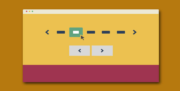
这是一组适合移动设备使用 CSS3 分页导航条插件。共有 11 种不同样式的分页导航条。它们在移动设备上能够很好的工作,是一款移动优先的分页导航条插件。你可以通过 CSS 或 SASS 文件很容易的重新定制分页导航的样式。分页导航条的作用是用户通过分页链接来浏览你的全部内容。一个可替代的方法是使用瀑布流布局,它们各有长处和短处。
HTML 结构
所有的分页导航条 DEMO 的 html 结构都是一样的:使用一个<nav>元素来包裹一个无序列表。列表项中的.button 是前一页和后一页按钮。
也想出现在这里?联系我们吧

<nav role="navigation">
<ul class="cd-pagination no-space">
<li class="button"><a href="#0">Prev</a></li>
<li><a href="#0">1</a></li>
<li><a href="#0">2</a></li>
<li><a class="current" href="#0">3</a></li>
<li><a href="#0">4</a></li>
<li><span>...</span></li>
<li><a href="#0">20</a></li>
<li class="button"><a href="#0">Next</a></li>
</ul>
</nav> <!-- cd-pagination-wrapper -->
CSS 样式
最容易的改变分页导航条主题的方法是通过 SASS。插件中提供了 SASS 文件( _variables.scss),你可以通过变量来修改它们:
// colors
$color-1: #2E4057; // Pickled Bluewood
$color-2: #64a281; // Aqua Forest
$color-3: #ffffff; // White
// fonts
$primary-font: 'PT Sans', sans-serif;
// border-radius
$border-radius: .25em;
通过修改颜色变量你可以制作出很多不同效果的分页导航条。如果你不喜欢 SASS,你可以通过 style.css 文件来修改它们。在例子中有一组(可选的)class 可以用来改变分页导航条的样式。这些 class 都被应用到<ul>元素上。 .cd-pagination 类是基本的样式,你不可以移除它。最简单的查看这些分页导航条 class 的样式的方法是看我们提供的 demo,共有 11 种效果,下面是 .custom-icons 的例子:
/* --------------------------------custom icons - customize the small arrow inside the next and prev buttons-------------------------------- */.cd-pagination.custom-icons .button a {
position: relative;
}.cd-pagination.custom-icons .button:first-of-type a {
padding-left: 2.4em;
}.cd-pagination.custom-icons .button:last-of-type a {
padding-right: 2.4em;
}.cd-pagination.custom-icons .button:first-of-type a::before,
.cd-pagination.custom-icons .button:last-of-type a::after {
content: '';
position: absolute;
display: inline-block;
/* set size for custom icons */width: 16px;
height: 16px;
top: 50%;
/* set margin-top = icon height/2 */margin-top: -8px;
background: transparent url("../img/cd-icon-arrow-1.svg") no-repeat center center;
}.cd-pagination.custom-icons .button:first-of-type a::before {
left: .8em;
}.cd-pagination.custom-icons .button:last-of-type a::after {
right: .8em;
transform: rotate(180deg);
}
提示建议
在小屏幕的移动设备上,我们移除了 numbers 类,只为分页导航提供“前一页”和“后一页”
可以在分页导航的<a>元素上使用 class .disabled 来禁用某个链接
class .current 用于高亮当前分页导航的 number 链接
只有在和 .custom-icons 结合使用时, .animated-buttons 才起作用。另外,<a>元素中的文字必须用<i>元素来包裹。
关于如何移除 INLINE-BLOCK 元素之间的空白的问题,这里是一个小技巧。当你把列表元素设置为 inline-block 时,由于需要水平对齐它们,你会想到给它们一个 margin 值。这里给出几个你可以选择的方案:
为列表项设置一个负的 margin 值
让所有的列表项都浮动起来(例如:float:left;)。但要记住为<ul>元素或它们父元素使用 clearfix hack
去除掉每一个列表项的关闭标签 </li>。这个方法看起来不可思议,但却是一个十分好的解决方案。你可以参考 DEMO4 的分页导航条。
<nav role="navigation">
<ul class="cd-pagination no-space move-buttons custom-icons">
<li class="button"><a href="#0">Prev</a>
<li><a href="#0">1</a>
<li><a href="#0">2</a>
<li><a class="current" href="#0">3</a>
<li><a href="#0">4</a>
<li><span>...</span>
<li><a href="#0">20</a>
<li class="button"><a href="#0">Next</a>
</ul></nav> <!-- cd-pagination-wrapper -->
| 演示地址 | 下载地址 |
专业提供WordPress主题安装、深度汉化、加速优化等各类网站建设服务,详询在线客服!
也想出现在这里?联系我们吧