图片/图形
jQuery+CSS3鼠标滑过3D卡片翻转特效
 PetitQ
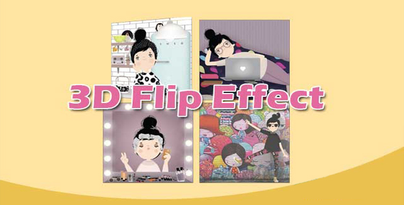
这是一款效果非常炫酷的 jQuery 和 CSS3 鼠标滑过 3D 卡片翻转特效。该卡片翻转特效使用 modernizr.js 来检测浏览器,当发现浏览器不支持 CSS3 翻转属性时,会将效果回退为简单的滑动显示效果。
制作方法
属性要引入 jQuery 和 modernizr.min.js 和 jquery.easing.min.js 文件。
也想出现在这里?联系我们吧

<script src="js/modernizr.min.js"></script>
<script src="js/jquery.min.js"></script>
<script src="js/jquery.easing.min.js"></script>
HTML 结构
该卡片翻转效果的 HTML 结构采用类似图片画廊的 HTML 结构:
<div class="artGroup slide">
<div class="artwork"> <img src="1.jpg">
<div class="detail">
<h3>Title</h3>
<p>Details...</p>
</div>
</div>
</div>
CSS 样式
为它添加一些必要的 CSS 样式:
.artGroup {
display: block;
width: 200px;
height: 200px;
position: relative;
margin: 0 10px 10px 10px;
float: left;
}.artwork {
display: block;
width: 100%;
height: 100%;
}.artGroup img {
width: 100%;
height: 100%;
position: absolute;
display: block;
border: 1px solid #333;
}.artGroup .detail {
display: block;
background: #fff;
width: 100%;
height: 100%;
position: absolute;
}.artGroup .detail h3 {
text-align: center;
color: orange;
}.artGroup .detail p {
text-align: left;
padding: 0 0.25em;
}
下面是使用 CSS3 来制作卡片翻转的效果:
.artGroup.flip {
-webkit-perspective: 800px;
perspective: 800px;
}.artGroup.flip .artwork {
-webkit-transition: -webkit-transform 1s ease;
transition: transform 1s ease;
-webkit-transform-style: preserve-3d;
transform-style: preserve-3d;
}.artGroup.flip .detail,
.artGroup.flip .theFlip {
-webkit-transform: rotateY(-180deg);
transform: rotateY(-180deg);
}.artGroup.flip img,
.artGroup.flip .detail {
-webkit-backface-visibility: hidden;
backface-visibility: hidden;
}
在旧浏览器中,使用下面的 CSS 来简单实现滑动效果。
.artGroup.slide { overflow: hidden; }
.artGroup.slide .detail { bottom: -364px; }
JAVASCRIPT
该卡片翻转特效使用 jQuery 来为相应的元素添加和删除相应的 class,完成卡片翻转的效果。
$(function () {
if ( $('html').hasClass('csstransforms3d') ) {
$('.artGroup').removeClass('slide').addClass('flip');
$('.artGroup.flip').on('mouseenter',
function () {
$(this).find('.artwork').addClass('theFlip');
});
$('.artGroup.flip').on('mouseleave',
function () {
$(this).find('.artwork').removeClass('theFlip');
});
} else {
$('.artGroup').on('mouseenter',
function () {
$(this).find('.detail').stop().animate({bottom:0}, 500, 'easeOutCubic');
});
$('.artGroup').on('mouseleave',
function () {
$(this).find('.detail').stop().animate({bottom: ($(this).height() + -1) }, 500, 'easeOutCubic');
});
}});
| 演示地址 | 下载地址 |
专业提供WordPress主题安装、深度汉化、加速优化等各类网站建设服务,详询在线客服!
也想出现在这里?联系我们吧