图片/图形
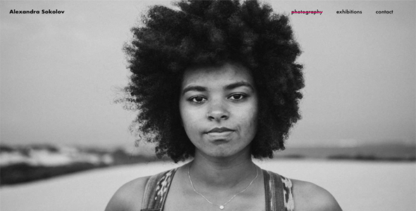
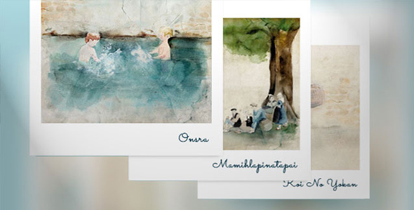
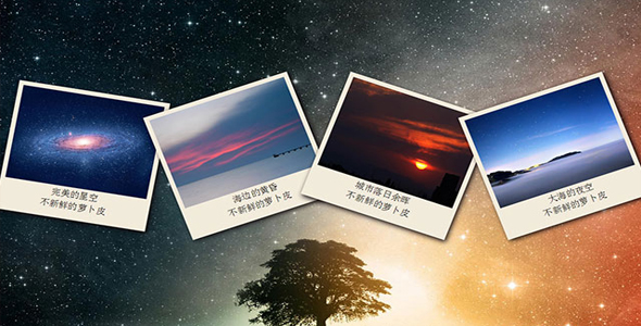
jQuery+css3炫酷3D互动图片画廊特效
 PetitQ
这是一款效果非常炫酷的 jQuery 和 css3 3D 互动图片画廊特效插件。遗憾的是该特效只在 WEBKIT 内核的浏览器中可以看到效果。
HTML 代码
使用一个 gallery div 作为 wrapper。里面每个 div item 是一个用于 3D 倾斜和旋转的图片。
也想出现在这里?联系我们吧

<div class="gallery">
<div class="item">
<img align="left" src="img/c2NAjXD.jpg"/>
</div>
<div class="item">
<img align="left" src="img/FeCziip.png"/>
</div>
<div class="item">
<img align="left" src="img/OYlw7Pw.jpg?"/>
</div>
<div class="item">
<img align="left" src="img/MVammek.jpg?"/>
</div>
<div href="#" class="item">
<img align="left" src="img/gfp57KR.png"/>
</div>
<div class="item">
<img align="left" src="img/FeCziip.png"/>
</div>
</div>
CSS 样式
3D 倾斜效果
body {margin: 0;
}.gallery {
margin: 0 auto;
width: 700px;
}.gallery .item{
cursor: pointer;
position: relative;
display: block;
float: left;
z-index: 1;
}.gallery .item img {
-webkit-transition-property: all;
-webkit-transition-duration: 0.7s;
box-shadow: -10px 10px 25px rgba(0,0,0,0.25);
max-width: 100%;
width: 190px;
height: 340px;
}
首先,我们简单的将图片排成一排。注意,所有的图片都使用图像占位,如果你想使用自己的图片,那么建议图片的尺寸要一样大小。否则你可能需要其他一些 jQuery 插件来帮助你排列你的图片,如:Woomark 或 Masonry。
CSS 样式
body {background: url(img/LBONKMh.jpg) repeat fixed right bottom;
margin: 0;
}.gallery {
margin: 0 auto;
width: 700px;
}.gallery .item{
cursor: pointer;
position: relative;
display: block;
float: left;
margin: 0 50px -175px;
z-index: 1;
transform-origin:20% 40%;
-webkit-transform: translate3d(0, -50px, 0) scaleY(0.57) rotate(-45deg);
-webkit-transition-property: all;
-webkit-transition-duration: 0.7s;
}.gallery .item img {
-webkit-transition-property: all;
-webkit-transition-duration: 0.7s;
box-shadow: -10px 10px 25px rgba(0,0,0,0.25);
max-width: 100%;
width: 190px;
height: 340px;
}
在这一步中将使用 CSS transform 来将图片进行 3d 倾斜。
CSS 样式
互动效果
.gallery .item{
cursor: pointer;
position: relative;
display: block;
float: left;
margin: 0 50px -175px;
z-index: 1;
transform-origin:20% 40%;
-webkit-transform: translate3d(0, -50px, 0) scaleY(0.57) rotate(-45deg);
-webkit-transition-property: all;
-webkit-transition-duration: 0.7s;
}.gallery .item img {
-webkit-transition-property: all;
-webkit-transition-duration: 0.7s;
box-shadow: -10px 10px 25px rgba(0,0,0,0.25);
max-width: 100%;
width: 190px;
height: 340px;
}.gallery .item:hover {
z-index: 2;
-webkit-transform: translate3d(0, -50px, 0) scaleY(0.57) rotate(-45deg) scale(1.2);
}.gallery .item.clicked{
z-index: 3;
-webkit-transform:none;
}
JAVASCRIPT
$(document).ready(function() {
$(".item").click(function (e) {
e.stopPropagation();
$(".item").removeClass("clicked");
$(this).toggleClass("clicked");
$("body").addClass("showing-item");
});
$('html').click(function() {
$(".item").removeClass("clicked");
$("body").removeClass("showing-item");
});
});
确保在上面代码之前引入 jQuery 文件。这一步将制作出鼠标滑过图片和点击图片是的效果。
HTML 结构
添加图片提示效果
<div class="gallery">
<div class="item">
<img align="left" src="img/c2NAjXD.jpg"/>
<span class="caption">
<h1>
htmleaf.com</h1>
<p>
Lorem ipsum dolor sit amet, consectetur adipisicing elit, sed do eiusmod tempor incididunt ut labore et dolore magna aliqua. Ut enim ad minim veniam, quis nostrud exercitation ullamco laboris
</p>
</span>
</div>
<div class="item">
<img align="left" src="img/FeCziip.png"/>
<span class="caption">
<h1>
htmleaf.com</h1>
<p>
Lorem ipsum dolor sit amet, consectetur adipisicing elit, sed do eiusmod tempor incididunt ut labore et dolore magna aliqua. Ut enim ad minim veniam, quis nostrud exercitation ullamco laboris
</p>
</span>
</div>
<div class="item">
<img align="left" src="img/OYlw7Pw.jpg?1"/>
<span class="caption">
<h1>
htmleaf.com</h1>
<p>
Lorem ipsum dolor sit amet, consectetur adipisicing elit, sed do eiusmod tempor incididunt ut labore et dolore magna aliqua. Ut enim ad minim veniam, quis nostrud exercitation ullamco laboris
</p>
</span>
</div>
<div class="item">
<img align="left" src="img/MVammek.jpg?1"/>
<span class="caption">
<h1>
htmleaf.com</h1>
<p>
Lorem ipsum dolor sit amet, consectetur adipisicing elit, sed do eiusmod tempor incididunt ut labore et dolore magna aliqua. Ut enim ad minim veniam, quis nostrud exercitation ullamco laboris
</p>
</span>
</div>
<div href="#" class="item">
<img align="left" src="img/gfp57KR.png"/>
<span class="caption">
<h1>
htmleaf.com</h1>
<p>
Lorem ipsum dolor sit amet, consectetur adipisicing elit, sed do eiusmod tempor incididunt ut labore et dolore magna aliqua. Ut enim ad minim veniam, quis nostrud exercitation ullamco laboris
</p>
</span>
</div>
<div class="item">
<img align="left" src="img/FeCziip.png"/>
<div class="caption">
<h1>
htmleaf.com</h1>
<p>
Lorem ipsum dolor sit amet, consectetur adipisicing elit, sed do eiusmod tempor incididunt ut labore et dolore magna aliqua. Ut enim ad minim veniam, quis nostrud exercitation ullamco laboris
</p>
</div>
</div>
</div>
CSS 样式
body {background: url(img/LBONKMh.jpg) repeat fixed right bottom;
margin: 0;
}body.showing-item .item:not(.clicked){
-webkit-filter: blur(2px) grayscale(0.5) opacity(0.8);
}.gallery {
margin: 0 auto;
width: 700px;
}.gallery .item{
cursor: pointer;
position: relative;
display: block;
float: left;
margin: 0 50px -175px;
z-index: 1;
transform-origin:20% 40%;
-webkit-transform: translate3d(0, -50px, 0) scaleY(0.57) rotate(-45deg);
-webkit-transition-property: all;
-webkit-transition-duration: 0.7s;
}.gallery .item:hover {
z-index: 2;
-webkit-transform: translate3d(0, -50px, 0) scaleY(0.57) rotate(-45deg) scale(1.2);
}.gallery .item.clicked{
z-index: 3;
-webkit-transform:none;
}.gallery .item .caption{
display: none;
border-radius: 3px 3px;
font-family: helvetica, arial;
background: white;
padding: 10px;
box-shadow: 0 1px 2px rgba(0,0,0,0.45);
width: 300px;
}.gallery .item .caption:after{
background-color: #fff;
box-shadow: -2px 2px 2px 0 rgba( 178, 178, 178, .4 );
content: "\00a0";
display: block;
height: 15px;
left: -5px;
position: absolute;
top: 50%;
margin-top: -7px;
-webkit-transform: rotate( 45deg );
width: 15px;
}.gallery .item.left .caption:after{
right: -8px;
left: auto;
box-shadow: 2px -1px 2px 0 rgba( 178, 178, 178, .4 );
}.gallery .item .caption h1{
color: black;
font-weight: 100;
text-align: center;
letter-spacing: -1px;
margin: 0 0 5px;
margin-bottom: 10px;
border-bottom: 1px solid #EFEFEF;
padding-bottom: 10px;
}.gallery .item .caption p{
color: #444;
font-weight: 100;}
.gallery .item.clicked .caption{
position: absolute;
top: 25px;
display: inline;
-webkit-transition-property: display;
-webkit-transition-duration: 0.7s;
}.gallery .item.clicked.right .caption {
left: 115%;
margin-left: 15px;
}.gallery .item.clicked.left .caption {
right: 115%;
margin-right: 15px;
}.gallery .item.clicked img {
box-shadow: 0 0 25px rgba(0,0,0,0.25);
-webkit-transform: scale(1.25);
}.gallery .item img {
-webkit-transition-property: all;
-webkit-transition-duration: 0.7s;
box-shadow: -10px 10px 25px rgba(0,0,0,0.25);
max-width: 100%;
width: 190px;
height: 340px;
}
JAVASCRIPT
$(document).ready(function () {
$(".item").click(function (e) {
e.stopPropagation();
$(".item").removeClass("clicked");
$(this).toggleClass("clicked");
$("body").addClass("showing-item");
var offset = $(this).offset();
var pos = offset.left + $(this).width()
var center = $(".gallery").width() / 2;
if (pos > center) {
var align = "left";
} else {
var align = "right";
}$(this).removeClass(".left, .right").addClass(align);
return false;
});
$('html').click(function () {
$(".item").removeClass("clicked");
$("body").removeClass("showing-item");
});
});
| 演示地址 | 下载地址 |
专业提供WordPress主题安装、深度汉化、加速优化等各类网站建设服务,详询在线客服!
也想出现在这里?联系我们吧