其他代码
Bootstrap超酷进度条动画UI设计
 PetitQ
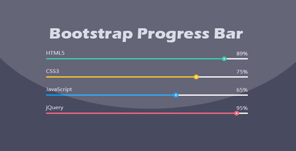
这是一款基于原生 Bootstrap 进度条组件制作的超酷进度条动画 UI 设计效果。该进度条在原生 Bootstrap 进度条组件的基础上,通过简单 CSS3 代码制作出非常炫酷的进度条动画特效。
HTML 结构
该进度条的 HTML 结构如下,每一个 div.progress 是一个进度条。其中,.progress-bar 元素上通过 style 属性来设置进度条的最终进度。
也想出现在这里?联系我们吧

<div class="container">
<div class="row">
<div class="col-md-6">
<h3 class="progressbar-title">HTML5</h3>
<div class="progress">
<div class="progress-bar" style="width: 85%; background: #ed687c;">
<span style="background: #ed687c;">85%</span>
</div>
</div>
<h3 class="progressbar-title">CSS3</h3>
<div class="progress">
<div class="progress-bar" style="width: 75%; background: #049dff;">
<span style="background: #049dff;">75%</span>
</div>
</div>
</div>
</div>
</div>
CSS 样式
进度条上的标题和文本的样式非常简单。整个进度条采用相对定位方式,并设置背景色,内阴影和外边距。
.progress_bar .pro-bar {
background: hsl(0, 0%, 97%);
box-shadow: 0 1px 2px hsla(0, 0%, 0%, 0.1) inset;
height:4px;
margin-bottom: 12px;
margin-top: 50px;
position: relative;
}.progress_bar .progress_bar_title{
color: hsl(218, 4%, 50%);
font-size: 15px;
font-weight: 300;
position: relative;
top: -28px;
z-index: 1;
}.progress_bar .progress_number{
float: right;
margin-top: -24px;
}
进度条上的动画刻度使用绝对定位,开始的时候刻度为 0,为刻度动画设置 1 秒钟的 linear 类型动画过渡效果,并在 2 秒时间内执行 animate-positive 动画。
.progress_bar .progress-bar-inner {
background-color: hsl(0, 0%, 88%);
display: block;
width: 0;
height: 100%;
position: absolute;
top: 0;
left: 0;
transition: width 1s linear 0s;
animation: animate-positive 2s;
}@-webkit-keyframes animate-positive{
0% { width: 0%; }
}@keyframes animate-positive{
0% { width: 0%; }
}
进度条刻度前面的小圆使用.progress-bar-inner 的:before 和:after 为元素来制作。
.progress_bar .progress-bar-inner:before {
content: "";
background-color: hsl(0, 0%, 100%);
border-radius: 50%;
width: 4px;
height: 4px;
position: absolute;
right: 1px;
top: 0;
z-index: 1;
}.progress_bar .progress-bar-inner:after {
content: "";
width: 14px;
height: 14px;
background-color: inherit;
border-radius: 50%;
position: absolute;
right: -4px;
top: -5px;
}
完整的 CSS 代码请参考下载文件。
| 演示地址 | 下载地址 |
专业提供WordPress主题安装、深度汉化、加速优化等各类网站建设服务,详询在线客服!
也想出现在这里?联系我们吧