HTML/CSS
纯CSS粘住固定底部的5种方法
 PetitQ
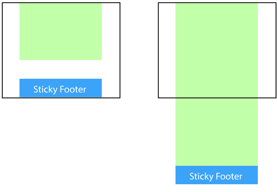
本文主要介绍一个 Footer 元素如何粘住底部,使其无论内容多或者少,Footer 元素始终紧靠在浏览器的底部。我们知道,当内容足够多可以撑开底部到达浏览器的底部,如果内容不够多,不足以撑开元素到达浏览器的底部时,下面要讲的布局就是解决如何使元素粘住浏览器底部。需求看下图:
方法一:
全局增加一个负值下边距等于底部高度,有一个全局的元素包含除了底部之外的所有内容。它有一个负值下边距等于底部的高度,就像这个演示链接。
也想出现在这里?联系我们吧

<body>
<div class="wrapper">
content
<div class="push"></div>
</div>
<footer class="footer"></footer>
</body>
HTML, body {
height: 100%;
margin: 0;
}.wrapper {
min-height: 100%;
/* Equal to height of footer *//* But also accounting for potential margin-bottom of last child */margin-bottom: -50px;
}.footer,.push {
height: 50px;
}
演示:
这个代码需要一个额外的元素.push 等于底部的高度,来防止内容覆盖到底部的元素。这个 push 元素是智能的,它并没有占用到底部的利用,而是通过全局加了一个负边距来填充。
方法二:
底部元素增加负值上边距,虽然这个代码减少了一个.push 的元素,但还是需要增加多一层的元素包裹内容,并给他一个内边距使其等于底部的高度,防止内容覆盖到底部的内容。
<body>
<div class="content">
<div class="content-inside">
content
</div>
</div>
<footer class="footer"></footer>
</body>
html, body {
height: 100%;
margin: 0;
}.content {
min-height: 100%;
}.content-inside {
padding: 20px;
padding-bottom: 50px;
}.footer {
height: 50px;
margin-top: -50px;
}
演示:
方法三:
使用 calc()计算内容的高度
<body>
<div class="content">
content
</div>
<footer class="footer"></footer>
</body>
.content {
min-height: calc(100vh - 70px);
}.footer {
height: 50px;
}
演示:
给 70px 而不是 50px 是为了为了跟底部隔开 20px,防止紧靠在一起。
方法四:
使用 flexbox 布局方式
<body>
<div class="content">
content
</div>
<footer class="footer"></footer>
</body>
html {height: 100%;
}body {min-height: 100%;
display: flex;
flex-direction: column;
}.content {
flex: 1;
}
演示:
方法五:
使用 grid 布局
<body>
<div class="content">
content
</div>
<footer class="footer"></footer>
</body>
html {height: 100%;
}body {min-height: 100%;
display: grid;
grid-template-rows: 1fr auto;
}.footer {
grid-row-start: 2;
grid-row-end: 3;
}
演示:
grid 早于 flexbox 出现,但并没有 flexbox 被广泛支持,你可能在 chrome Canary 或者 Firefox 开发版上才可以看见效果。
专业提供WordPress主题安装、深度汉化、加速优化等各类网站建设服务,详询在线客服!
也想出现在这里?联系我们吧